Improving UX for web3.career
Product
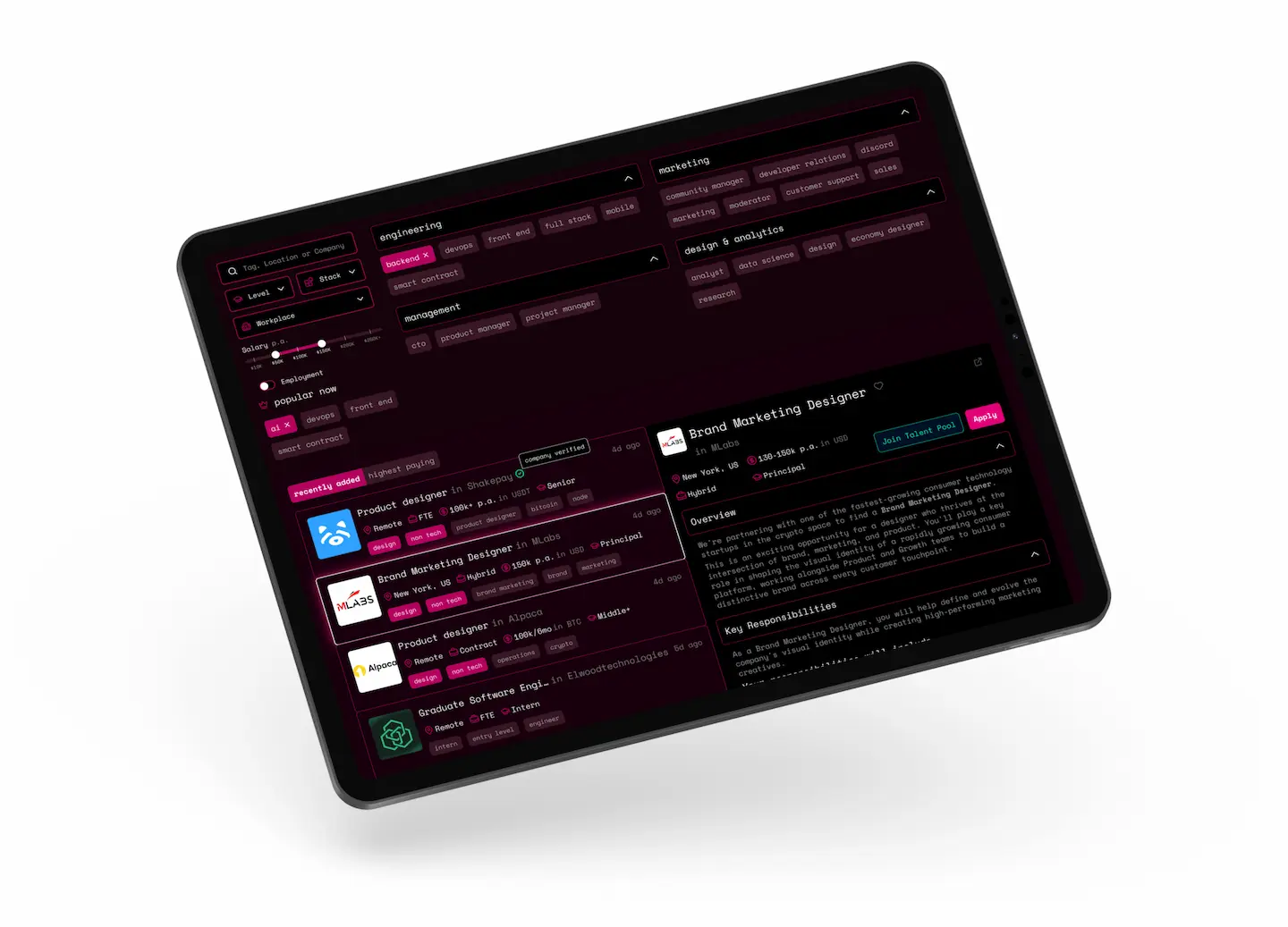
Web3.career is a major job and resume aggregator in decentralized technologies, blockchain, and cryptocurrency. The platform compiles job openings from companies worldwide and targets developers (Solidity, Smart Contracts), marketers, and Web3 security specialists.
Target Audience and Pain Points
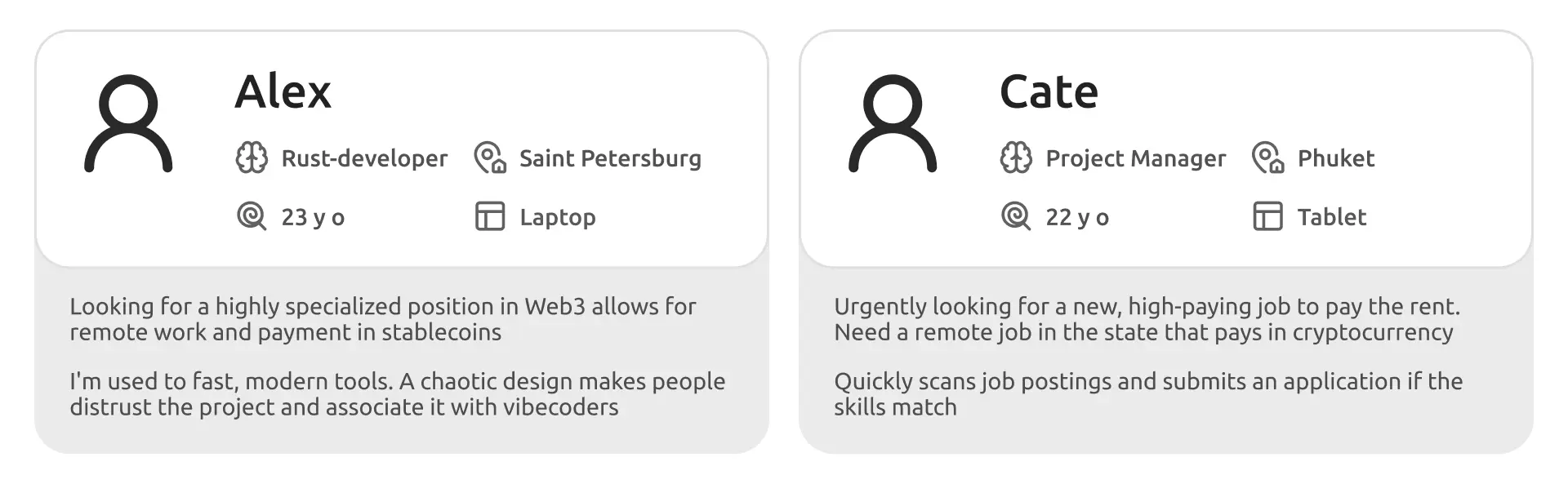
The product's primary target audience consists of developers and managers who want to work remotely, receive their salary in cryptocurrency, or both. Typical target audience profile:
User Journey
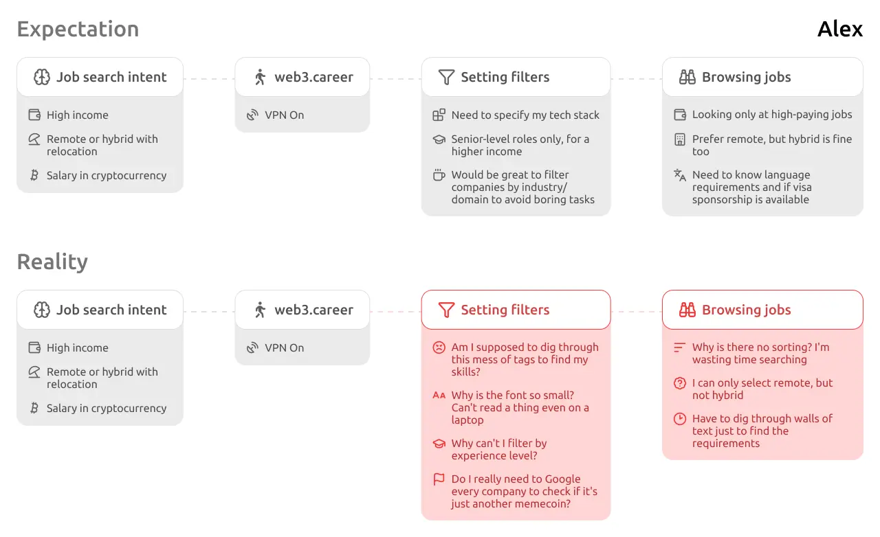
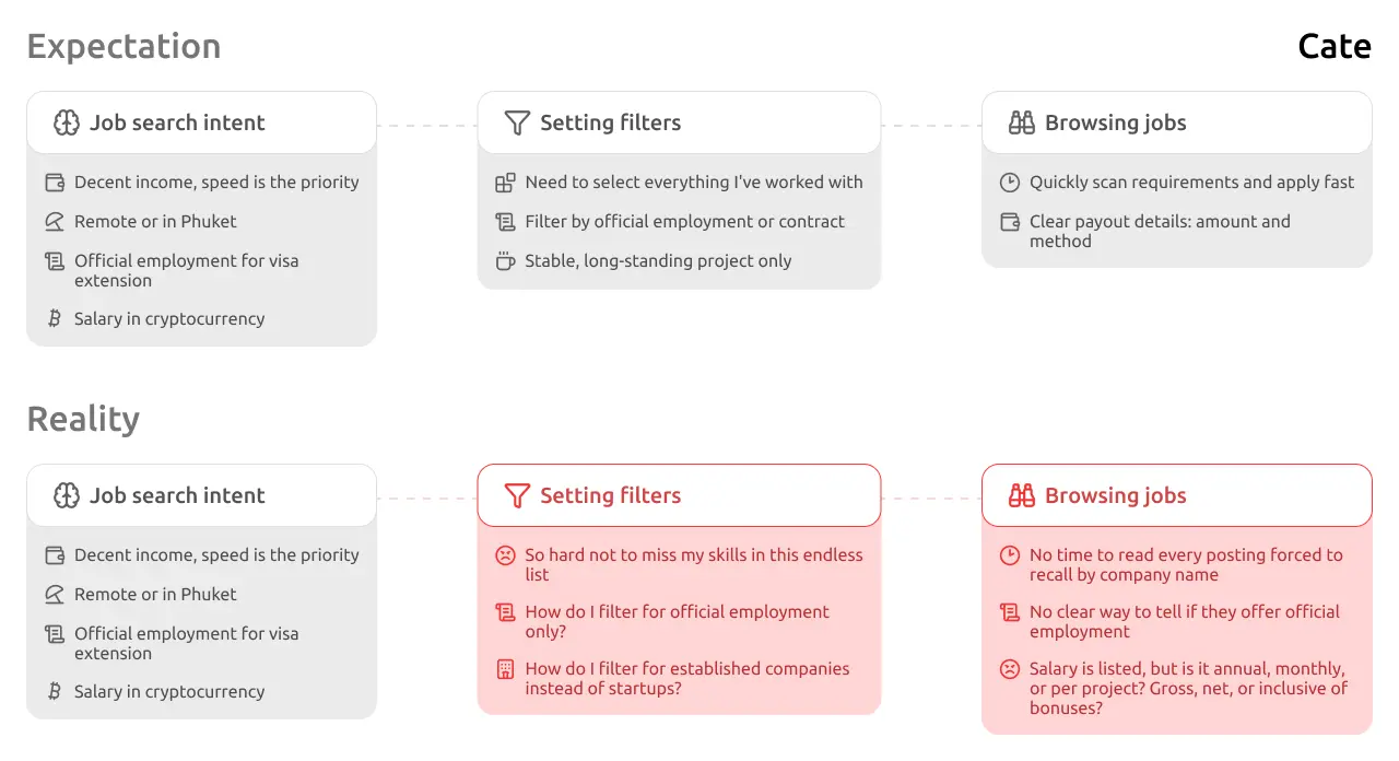
The reason I am redesigning this website in the first place is to reduce friction in the user journey—for both new visitors and returning users.
Filters Block
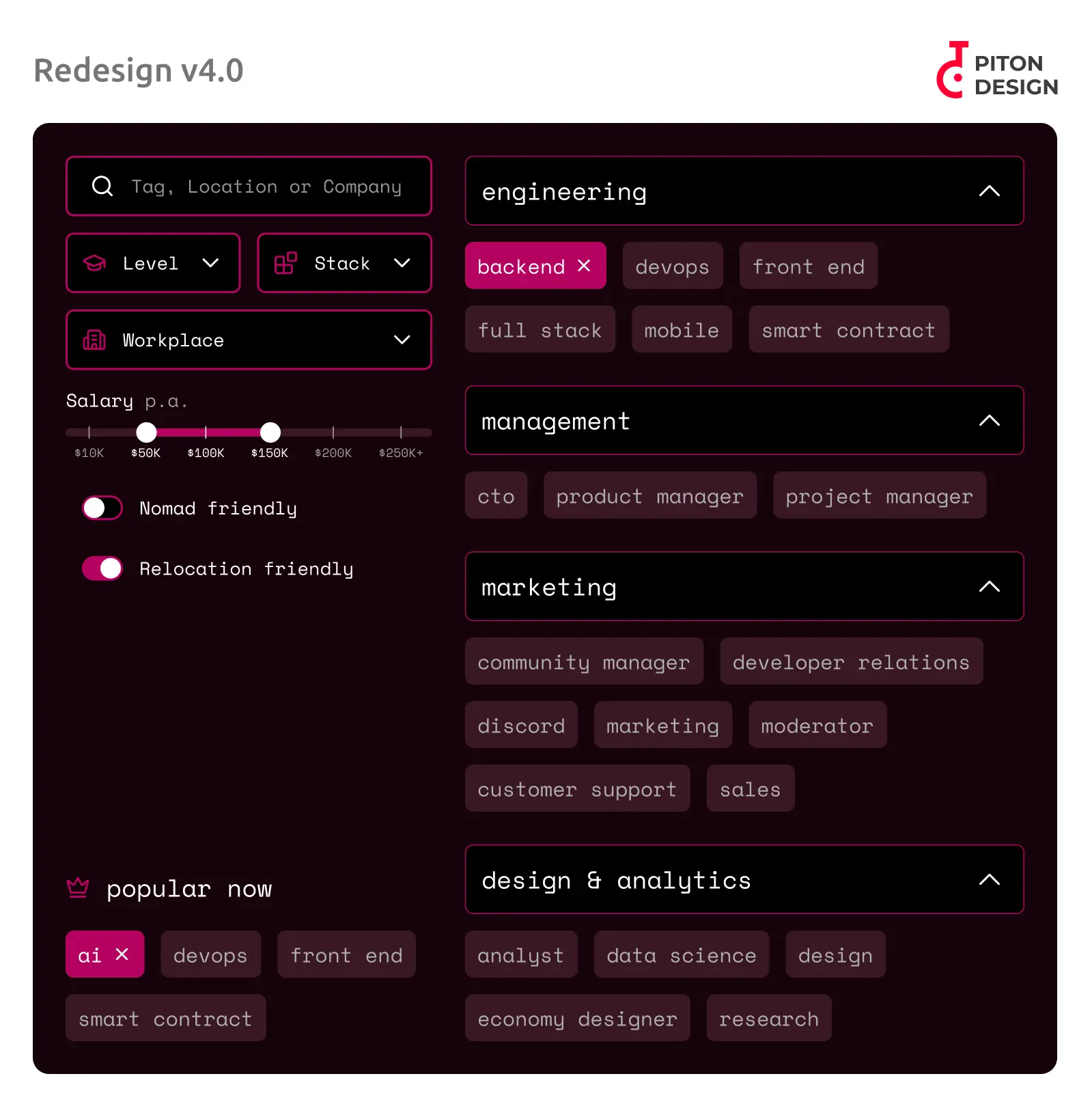
The current version of tag-based filtering and search on the website is poorly executed. Tags are piled together in alphabetical order, and the text is small, even on the desktop version. The only thing done well is the remote work toggle. However, if someone needs a hybrid format or on-site only, there is no such option. I redesigned the filters and developed two options; both are responsive on touch screens and support scaling without putting extra load on the user. I made minimal changes to the design system, but I enhanced the visualization of some elements with icons and inverted colors for others to make the design intuitive, compliant with WCAG 7:1, and aligned with accessibility standards.
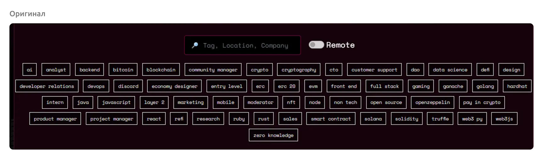
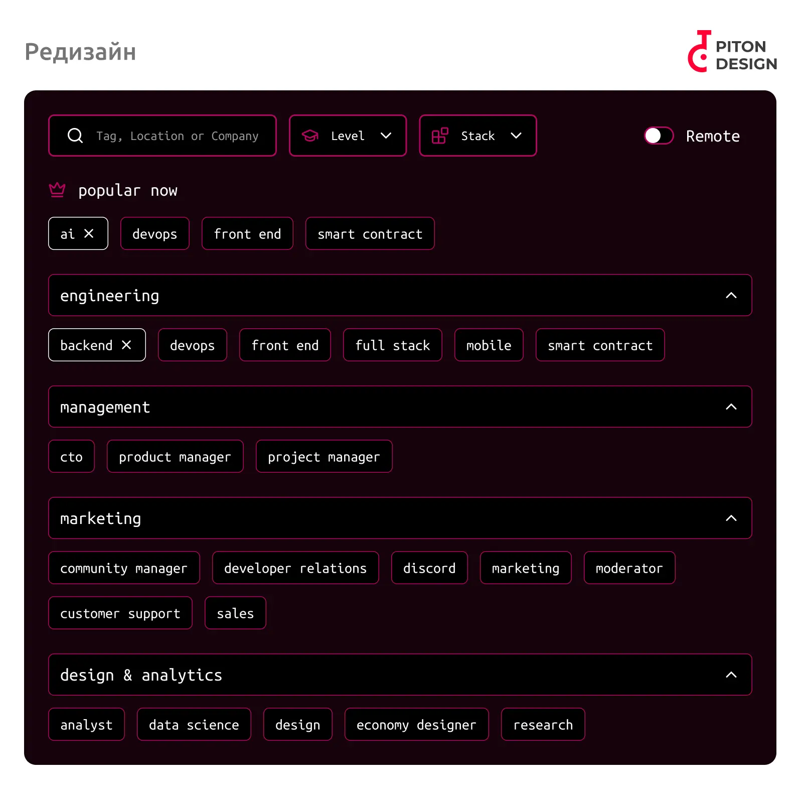
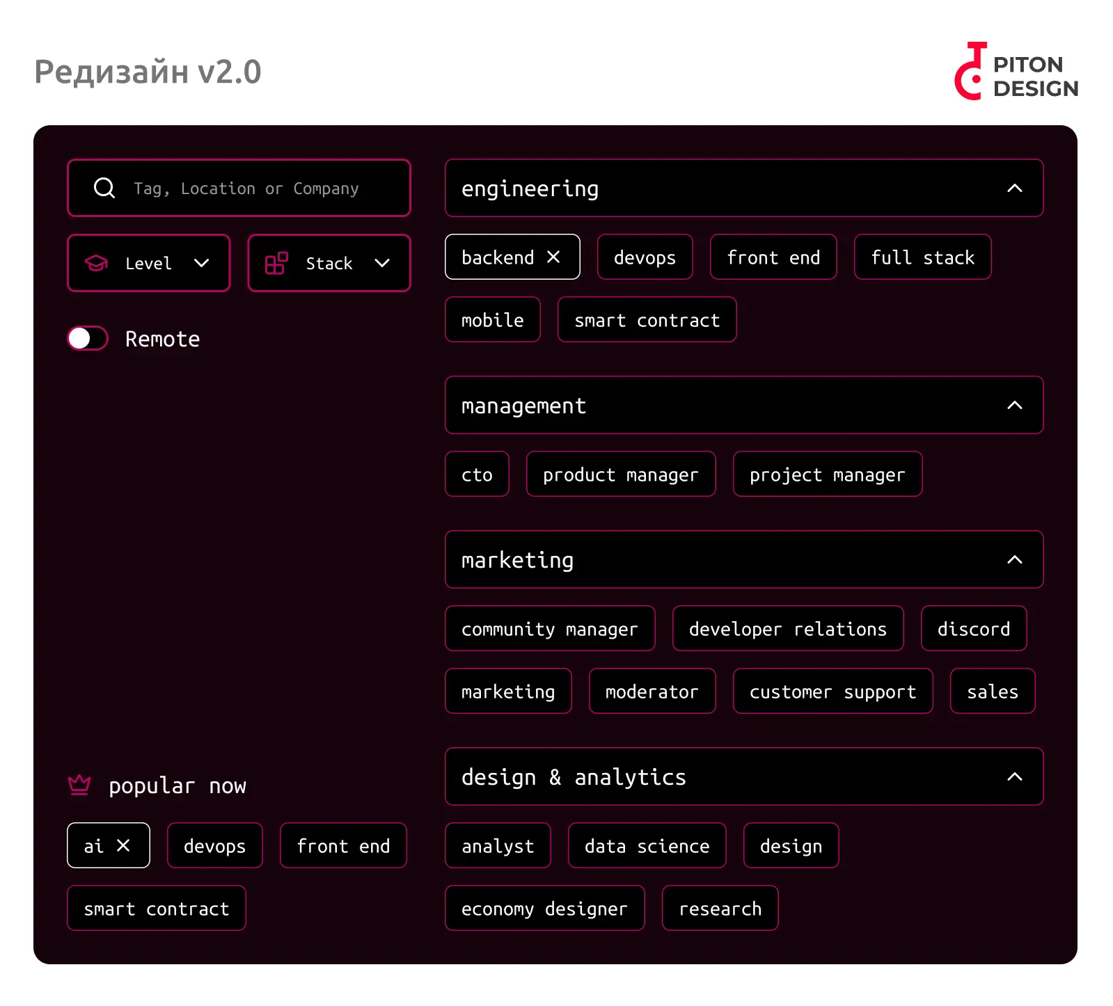
During the redesign process, I sorted blocks into categories and highlighted a separate section with popular paths, so users don't waste time searching through categories. I also expanded the filtering options tailored to the target audience: added dropdown menus for experience level and specific tech stacks (programming language, framework, blockchain), since it is crucial for job seekers to work within their specialized niche. I replaced emojis, which developers often associate with AI-generated content or low effort, with proper icons. This removes the need to read closely and allows for intuitive product use. In the original design, white badges represented unselected tags, while filled badges meant selected tags. I moved away from this approach because it is misleading and breaks the design system. If we choose to use an outline, we shouldn't randomly switch to a solid fill. To clearly isolate a selected tag, I added a close icon (cross), which also indicates that clicking it again will deselect it. I used white for the selected tag because its brightness contrast is higher than pink, instantly signaling to the user what they have chosen. In the first option, I kept the vertical layout mostly unchanged. In the second option, I placed the filters to the left of the categories—a common practice for larger displays (since most of the target audience works on desktops, this is a viable layout). This layout allows for adding more filters without turning the section into 'spaghetti'.
By the way, it turns out there actually is a sorting option for jobs on the website. It is located in the header and looks like navigation links to other pages. This violates the UX principle that a design should be intuitive. On top of that, the header is not sticky, which means users have to scroll all the way back to the top. Here is how I resolved these issues:
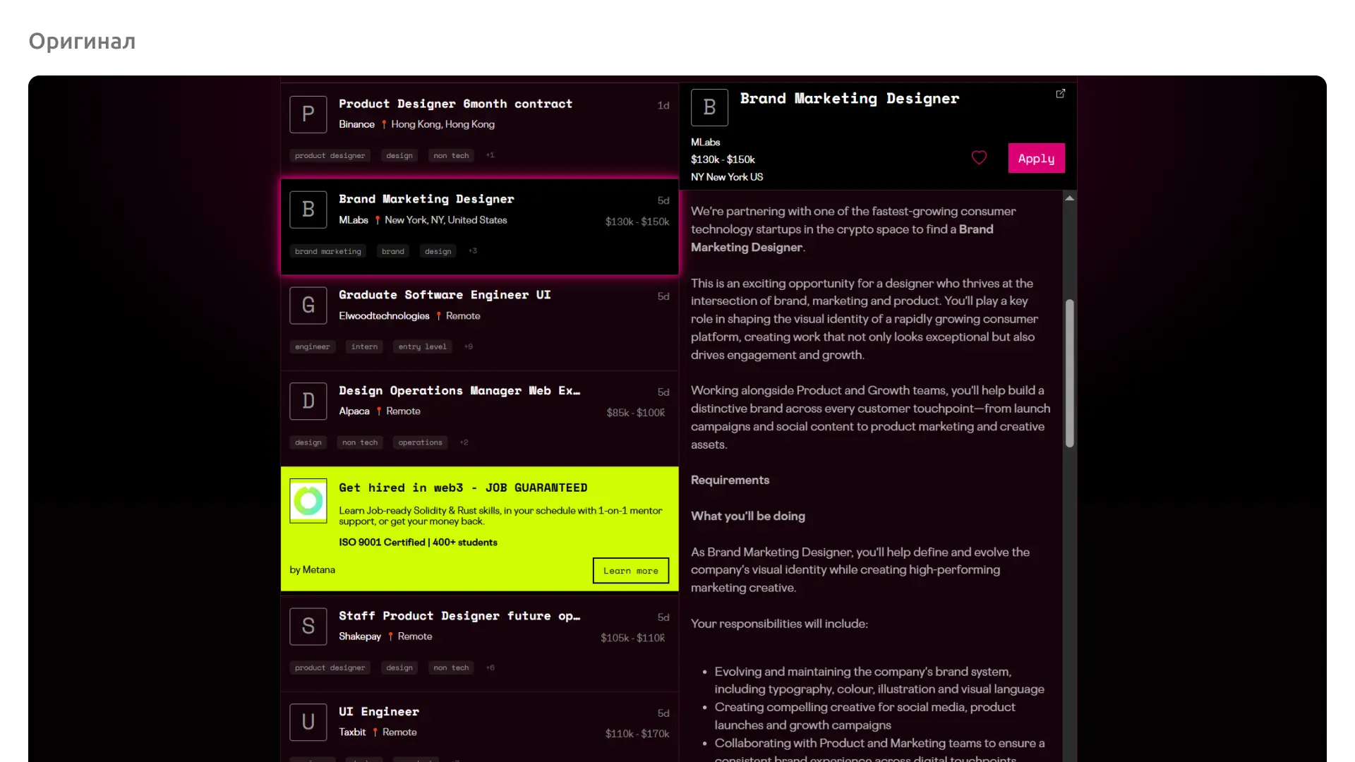
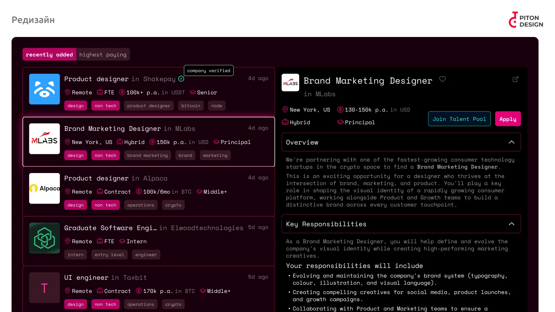
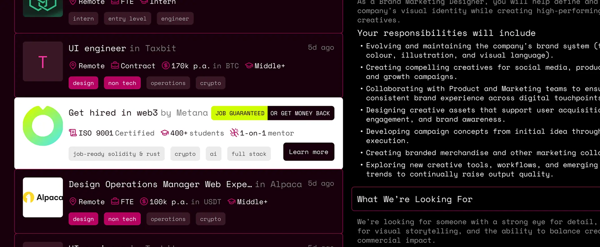
The first thing I changed was clearly defining salary expectations. Now, it is not an abstract '$150k' in a vacuum, but an annual salary or a rate for a 6-month contract in a specific fiat or cryptocurrency. Adding photos (where possible) instead of using the first letter of the job title increases trust in the company and speeds up visual searching based on familiar logos. If a company hasn't added a logo, we use the first letter of the company's name, not the job title. I also added company verification. This is an optional feature that addresses the target audience's fear that a company might be a fly-by-night operation. This badge also offers the project an additional monetization channel. I kept the job preview concept on the same page, which is a good design choice as it prevents navigating between pages and allows users to compare several jobs instantly. I broke the job card itself down into logical blocks (using a unified template for all jobs), enabling users to collapse blocks they have already read or find irrelevant and jump straight to the crucial information. I also redesigned the ad block to match the style of the job cards to overcome banner blindness. However, I kept it bright to distinguish it from standard job posts. I replaced the neon-green background with white to improve readability, using green only as an accent. The new card design speeds up the transition to the target action (Apply) because users can scan the accordion menus relevant to them in just a few seconds, rather than digging through a wall of solid text.
As for the tags in the jobs section: logically, it is better to make them genuinely informative, as they currently duplicate information from the job title and fail to reflect the actual candidate requirements.
At the last minute, when the concept was already finished, I visited the website and noticed they had updated their tag design, so I had to make adjustments to the layout. However, even in their new tag design, I introduced improvements by highlighting tags that the user had previously selected in the filters. This helps highlight which criteria the job meets and what else might be required. With that in mind, to ensure design consistency and an intuitive user experience, I’ve also redesigned the tags in the filters. Also, in the new version of the filters, I replaced the “Remote” toggle with a full-featured selection of work formats, but I moved the two toggles for digital nomad and relocation support to separate sections so that users can apply for a digital nomad visa or relocation on a work visa. I added an annual salary slider to set a comfortable range based on the workload:
Business Impact
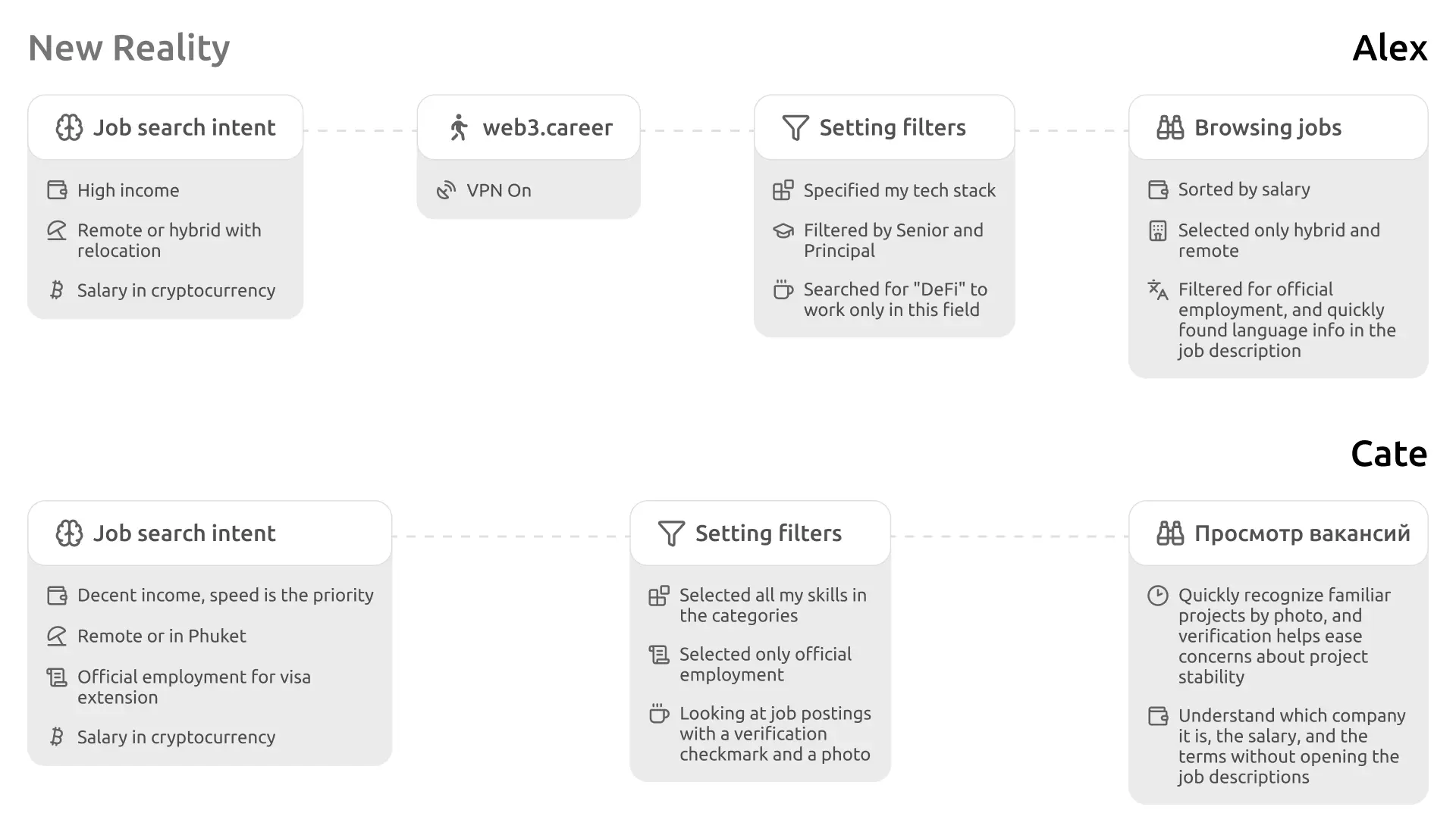
After redesigning the key blocks on the website, the user journey became significantly clearer and more intuitive:
Conclusion
The redesign makes the user journey clear and predictable. Now, Alex and Katya can quickly find companies they are interested in, review their details, and submit applications only to those that truly match their requirements. This helps improve the quality of applications, reducing the load on companies' HR departments and attracting more companies and candidates to the platform.