How to Lose a Yandex Job Offer Because of Two Letters
The Polished Pixel Syndrome
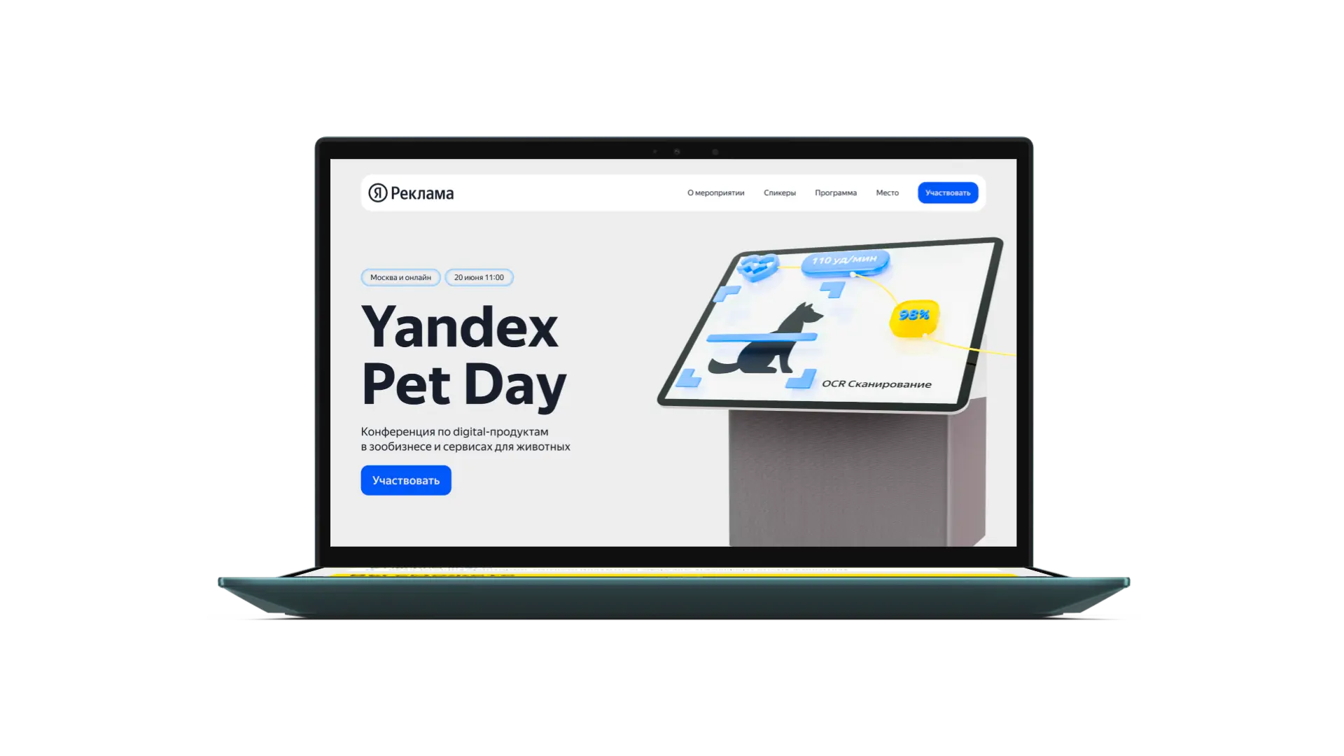
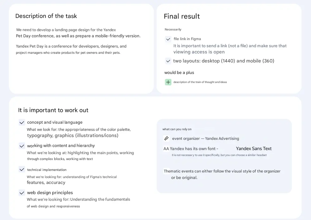
In the IT industry, it's common to hide failures and only showcase success stories where conversion rates skyrocketed by 300%. Real engineering is built on analyzing bugs. This case is an autopsy of a test assignment for Yandex. I’ll tell you how to create a technically flawless layout, build complex 3D graphics, align an ideal grid, and... get sent to the trash in 10 seconds because your brain switched off during the self-check phase. The task was a typical trap for a middle designer: develop a landing page design for an internal IT conference called Yandex Pet Day.
Technical Execution
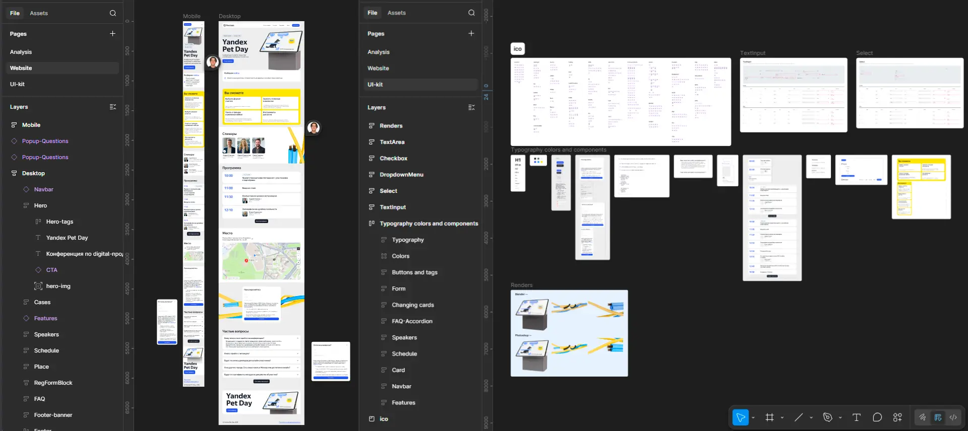
From a hard-skills perspective, the project was assembled like a Swiss watch. An 8-pixel modular grid. No 'Group 1383' layers—only Auto Layouts with clear naming that can withstand resizing and content changes. To ensure the interface felt like part of the Yandex ecosystem, we utilized elements from their open-source UI kit, Gravity UI, for complex input and checkbox states. Colors and typography were synced to libraries. A developer could have coded the layout without even opening the inspector panel. Instead of AI generation, we used Blender to render a 3D illustration of a Yandex speaker and cables in the company's signature sterile 3D style.
When a Designer Forgets How to Read
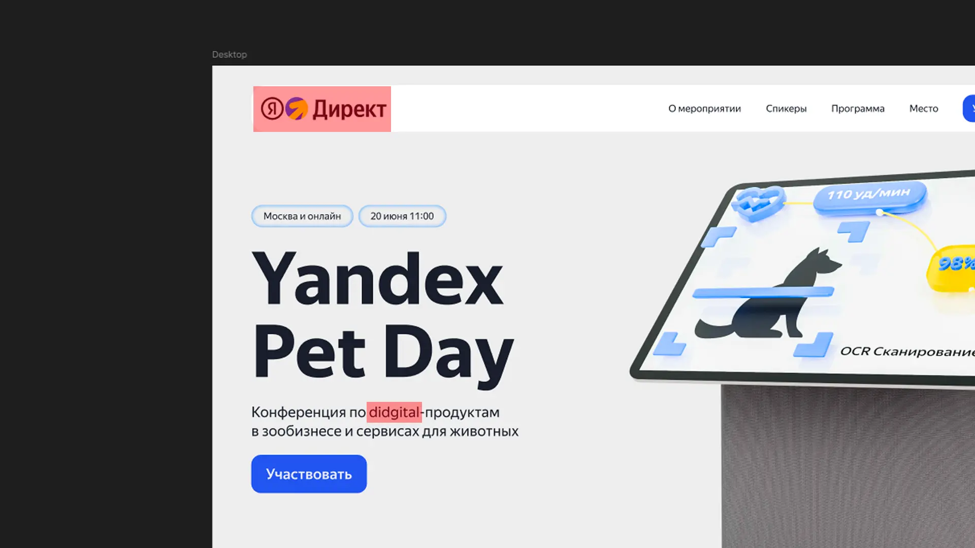
A lead designer reviewing a test task spends exactly 5 seconds on the first screen. They don't care about Auto Layouts if the hero section makes their eyes bleed. Bug #1: A typo in the hero block. In massive letters on the first screen, it said 'Conference on didgital products.' With two 'd's. A designer who doesn't proofread headlines is a production risk. No beautiful button can justify text that would make a million-person audience cringe. Bug #2: Brand context. We got carried away with reverse engineering and slapped the Yandex Direct logo in the header. However, the conference was by the umbrella brand Yandex Advertising and focused on pet-related projects and tech. Using the logo of a specific target-setting tool for an event aimed at developers and veterinarians showed a complete lack of understanding of the client's business structure.
What This Means for Clients
Yandex's rejection was absolutely deserved. However, in development, a crashed server is a reason to rewrite the architecture, not throw away the hardware. What conclusion did we draw for the studio? Polished UI is worthless if the logic is broken. Now, a bulletproof QA stage is built into our workflow before any client presentation: 1. Running all texts and headlines through spell-check. 2. Verifying the hierarchy of logos and the client's brand book.
This material reflects the author's personal experience while completing a test assignment for Yandex. The elements shown (including logos) are used solely to illustrate mistakes and are not intended to reproduce Yandex trademarks. All rights to the logos and brand elements belong to Yandex.
The Bottom Line
Everyone makes mistakes. Engineers find vulnerabilities in their work, log them, and implement 'fool-proofing' for future projects.