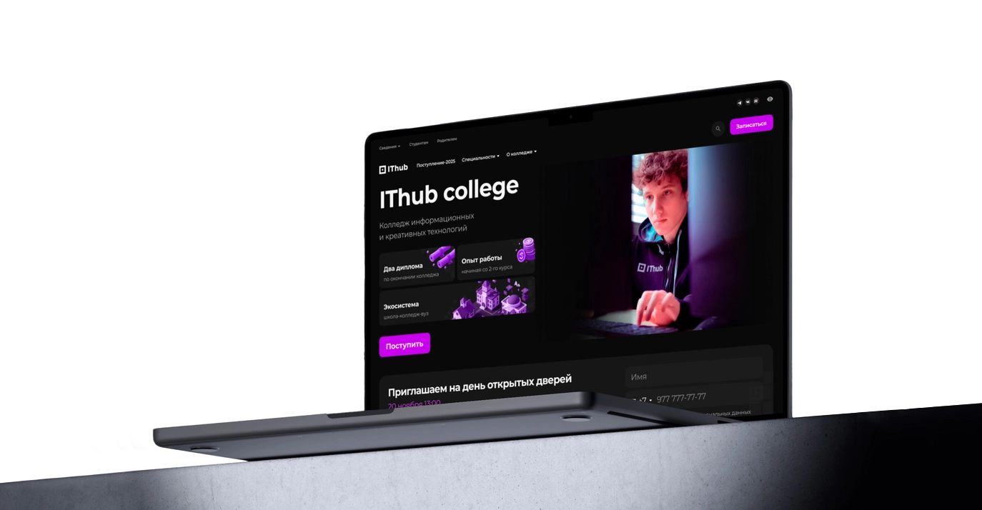
IThub College Homepage
Interface that sells
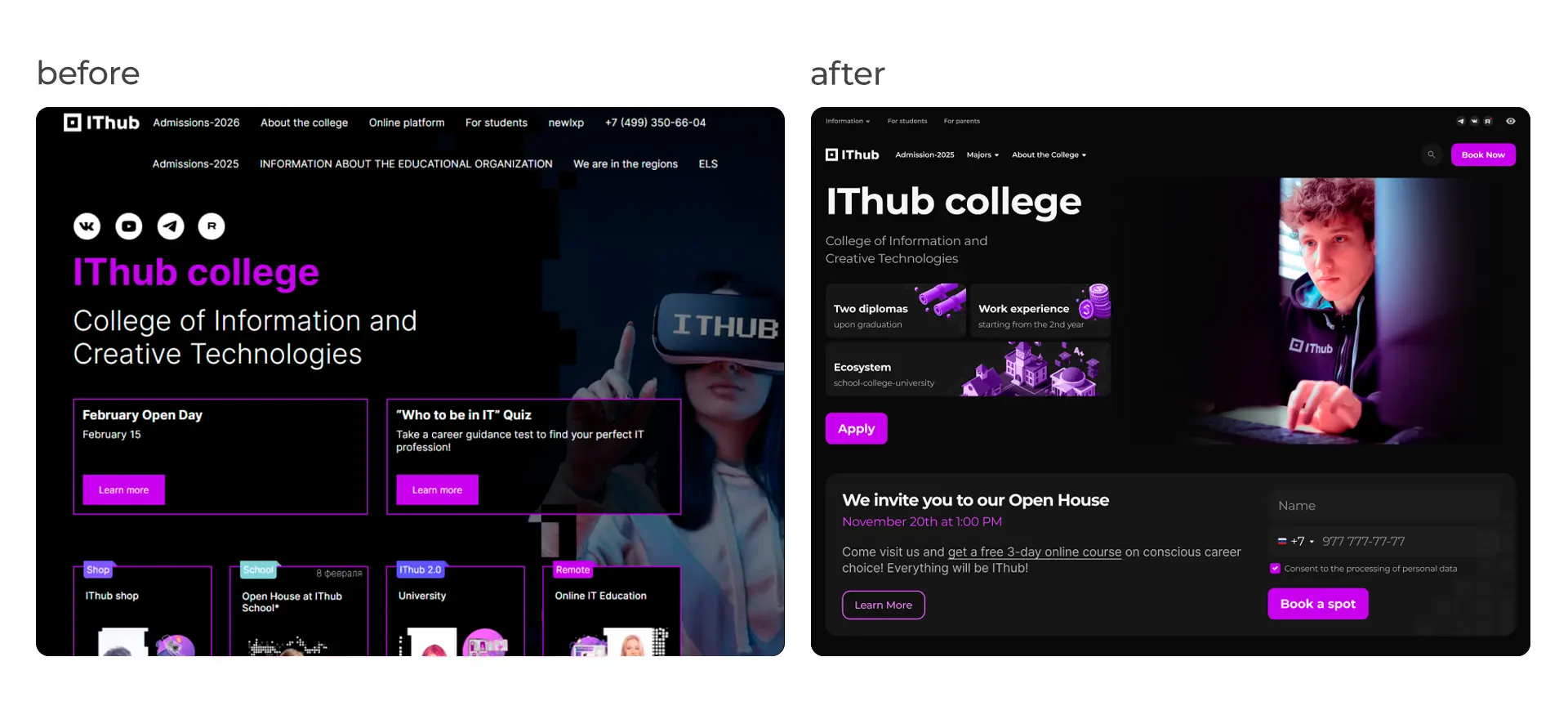
While public universities are designing digital wall newspapers from the 2000s, we build interfaces that sell. If a college website looks worse than a generic 'success course' landing page, you lose the applicant in 3 seconds. The task was to turn an educational institution into a place where people want to bring their money. The client approached us with a commercial college that had ambitions but lacked clear positioning and had an ancient landing page. The project was based on a conflict of audiences: the site must be loved by teenagers (the target audience), but the money is paid by parents (decision-makers). The current visuals were infantile, and the content was bureaucratic. Our task was to develop a visual concept that would sell the college like an IT startup.
Jobs To Be Done
We are dealing with two opposite psychotypes on one screen. Trying to please everyone means making a grey mass. We separated the flows visually and semantically. The teenager doesn't care about state standards. They want vibes, a community, and to feel like the hero of Mr. Robot. Solution: dark mode, neon palette, 3D mascots, and cyberpunk aesthetics. The parent doesn't care about neon because they want guarantees, diplomas, and investment security.
Visual Architecture
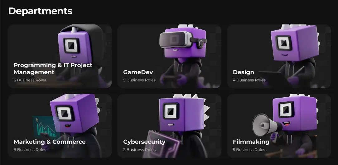
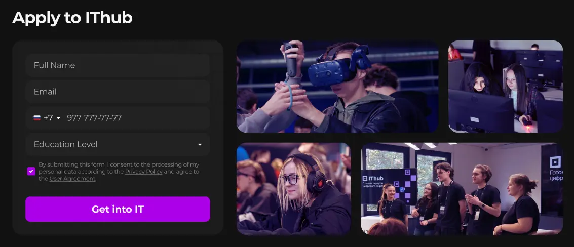
We moved away from low-quality real photos that cheapened the brand. Instead, we implemented AI generation and 3D assets of the college mascot. Instead of stock photos of a happy teenager with a juice box, we added real photos of the college. This set a quality bar that the client is now obliged to meet in their content.
Engineering and Handling Objections
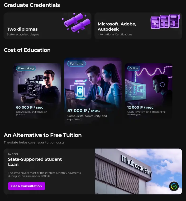
The main pain of paid education is the tuition cost. Seeing a price tag of 60,000 ₽/month and leaving is a standard parent scenario. We intercepted this scenario. Instead of an Excel price list, we made tariff cards with color coding. We implemented an 'Educational Loan' block immediately after the price. We don't apologize for it being paid; we provide a solution. We turn an unbearable expense into a smart investment in the future.
Navigation Cleanup
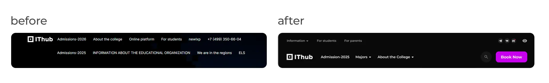
We killed bureaucracy and instead of a mess of links, we made a two-level short menu with a dropdown list. Search was collapsed into an icon, freeing up 20% of useful screen area for content.
Summary
The client received a top-studio level concept for a freelance budget. The college website looks like the Netflix interface, not a government portal. The design was accepted without 'taste discussions' because every decision was justified by money and user psychology.