Power Machines Career Portal
Personnel is everything. Broken UX means no personnel.
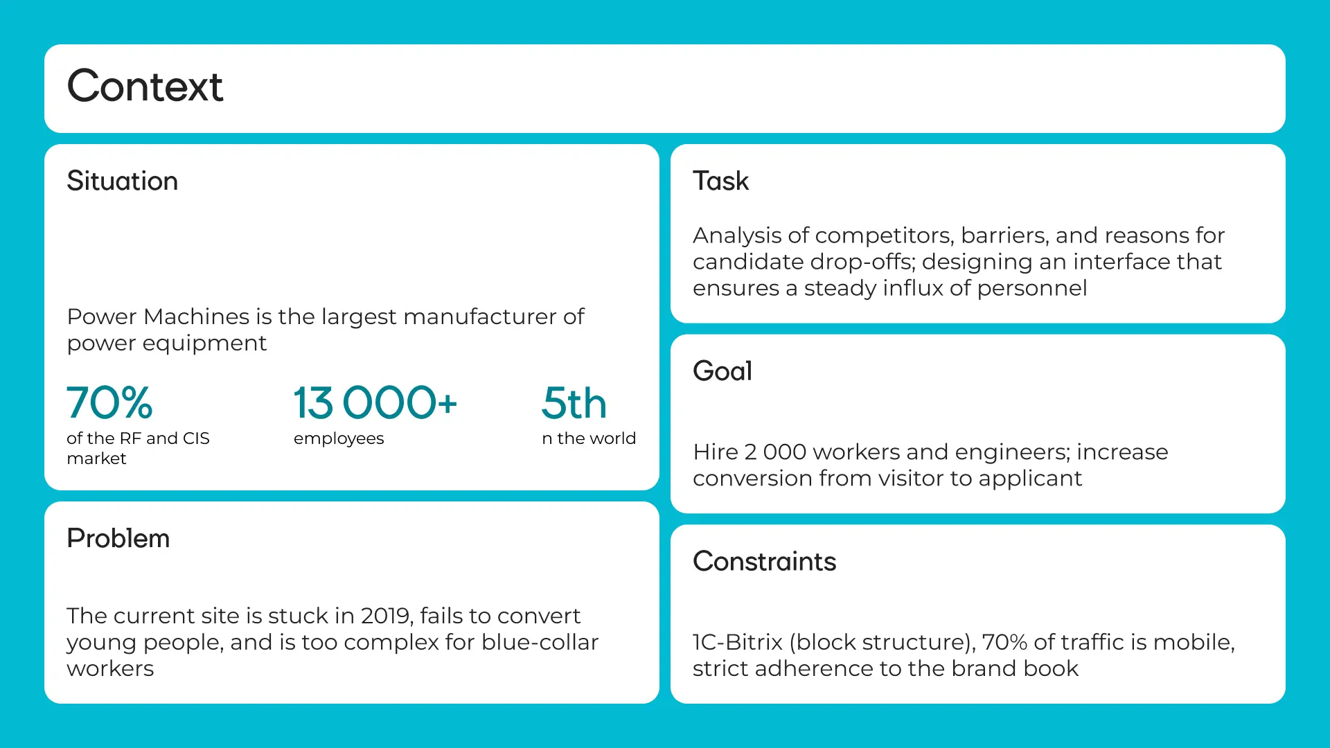
Power Machines is Russia's largest energy equipment manufacturer. 70% of the Russian and CIS market, 13,000+ employees, 5th place globally by equipment volume, clients in 57 countries. Yet the career site was stuck in 2019 and wasn't converting young talent into applicants. The problem wasn't the brand — it was the tool. The site didn't function as a hiring funnel: 70% of traffic came from mobile, but the mobile version was unusable. Filters were buried, the path to an application took 7 clicks, and job listings were written in HR-speak, not plain language. The task: redesign the portal so it hires 2,000 people a year on its own — no managers holding candidates by the hand. Constraints: a strict brand book, a legacy 1C-Bitrix engine, and no changes to the color palette.
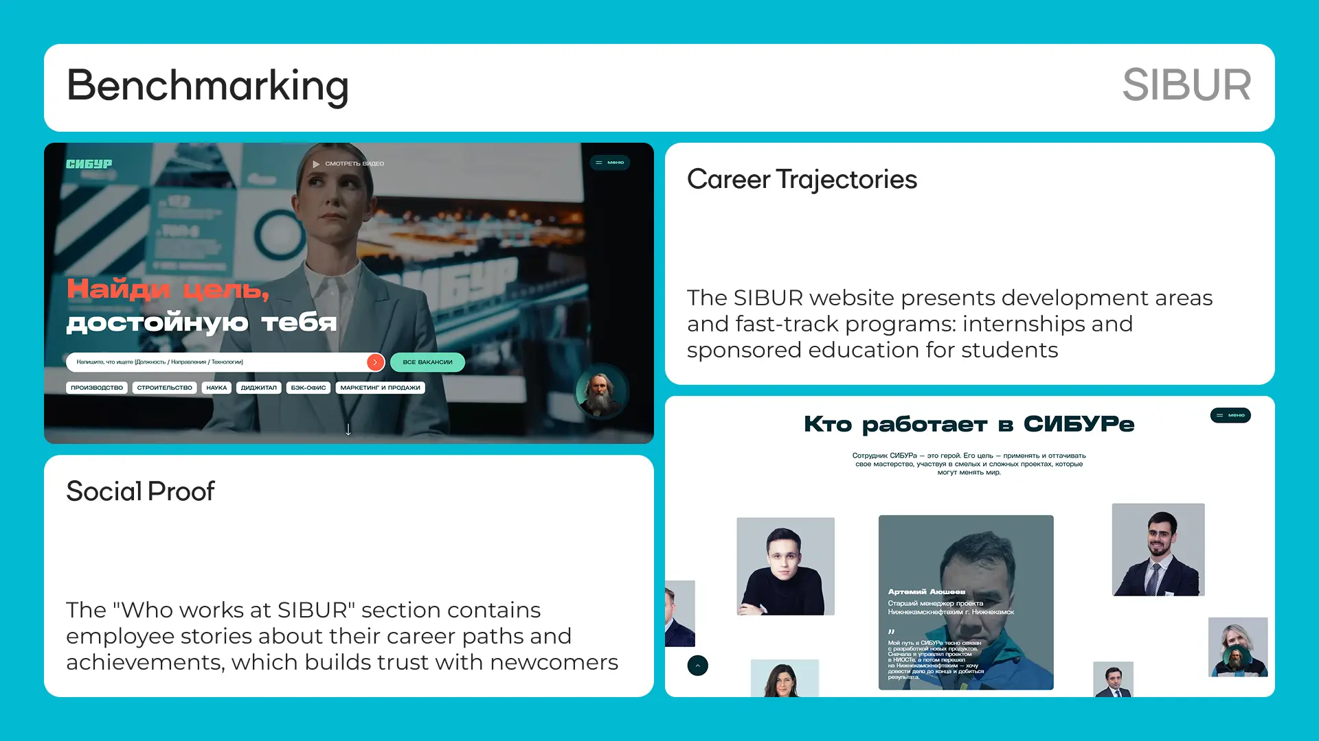
Benchmarking: what competitors get right
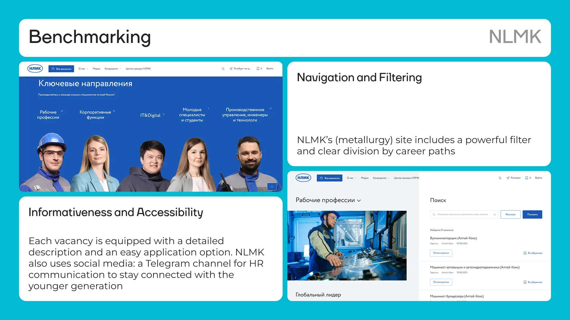
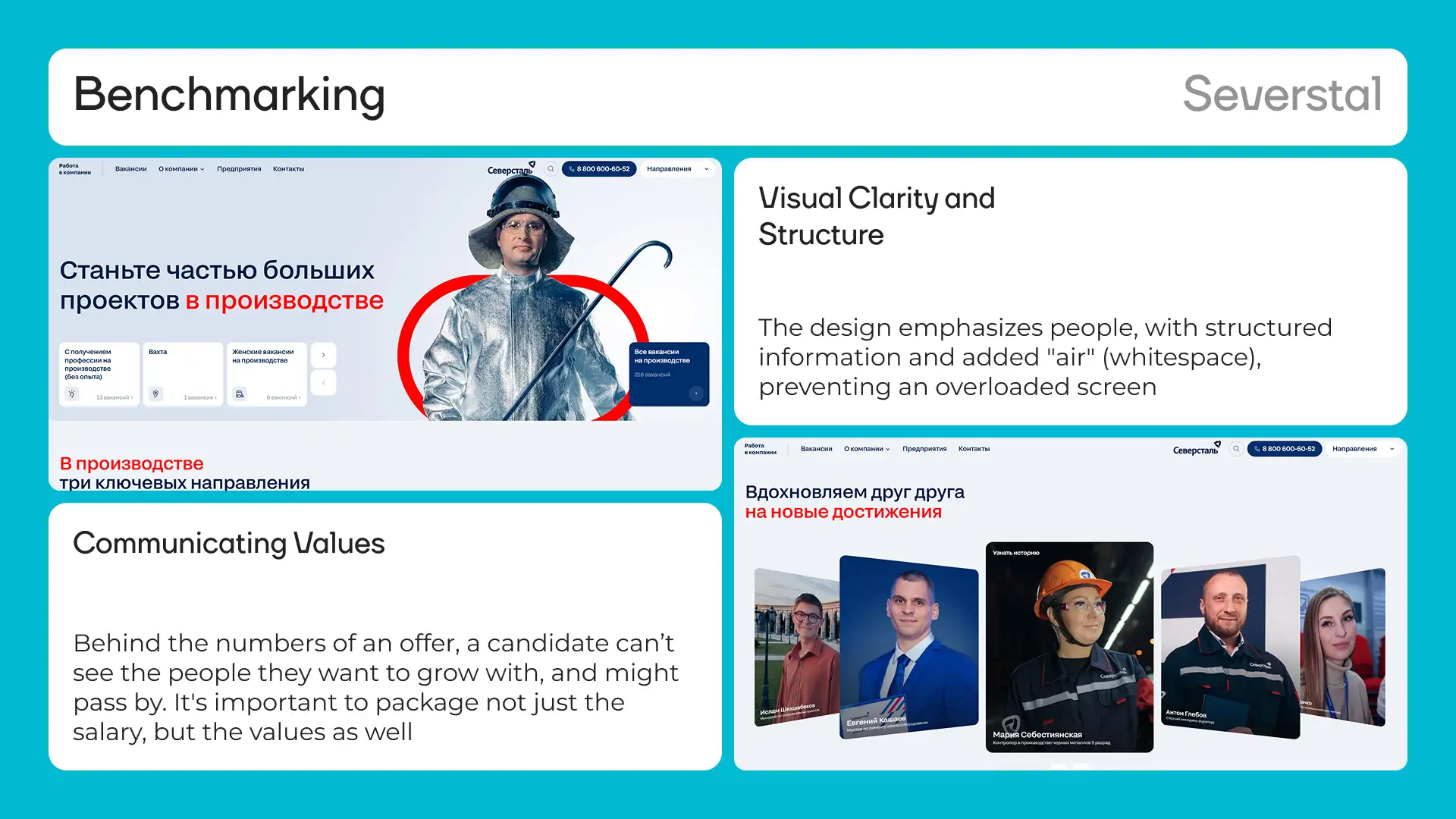
Before designing anything, I analyzed the three strongest HR portals in heavy industry: NLMK, Severstal, and SIBUR. Each had something worth borrowing. NLMK has a powerful filter right in the header with direction-based navigation — a candidate reaches relevant vacancies in one click. Plus a Telegram channel for HR communication, because young people don't make phone calls. Severstal's design is built around people. The 'We inspire each other' section with real employee photos breaks down a newcomer's skepticism — they see future colleagues, not corporate gloss. Visual clarity with no cluttered screens. SIBUR shows career trajectories and fast-track growth programs directly on the site. The 'Who works at SIBUR' section with employee career stories builds trust where previously there were only lists of requirements. Conclusion: a good-looking site is not enough. You need a working system — filtering, structured vacancies, social proof, and a path from landing to application in the fewest steps possible.
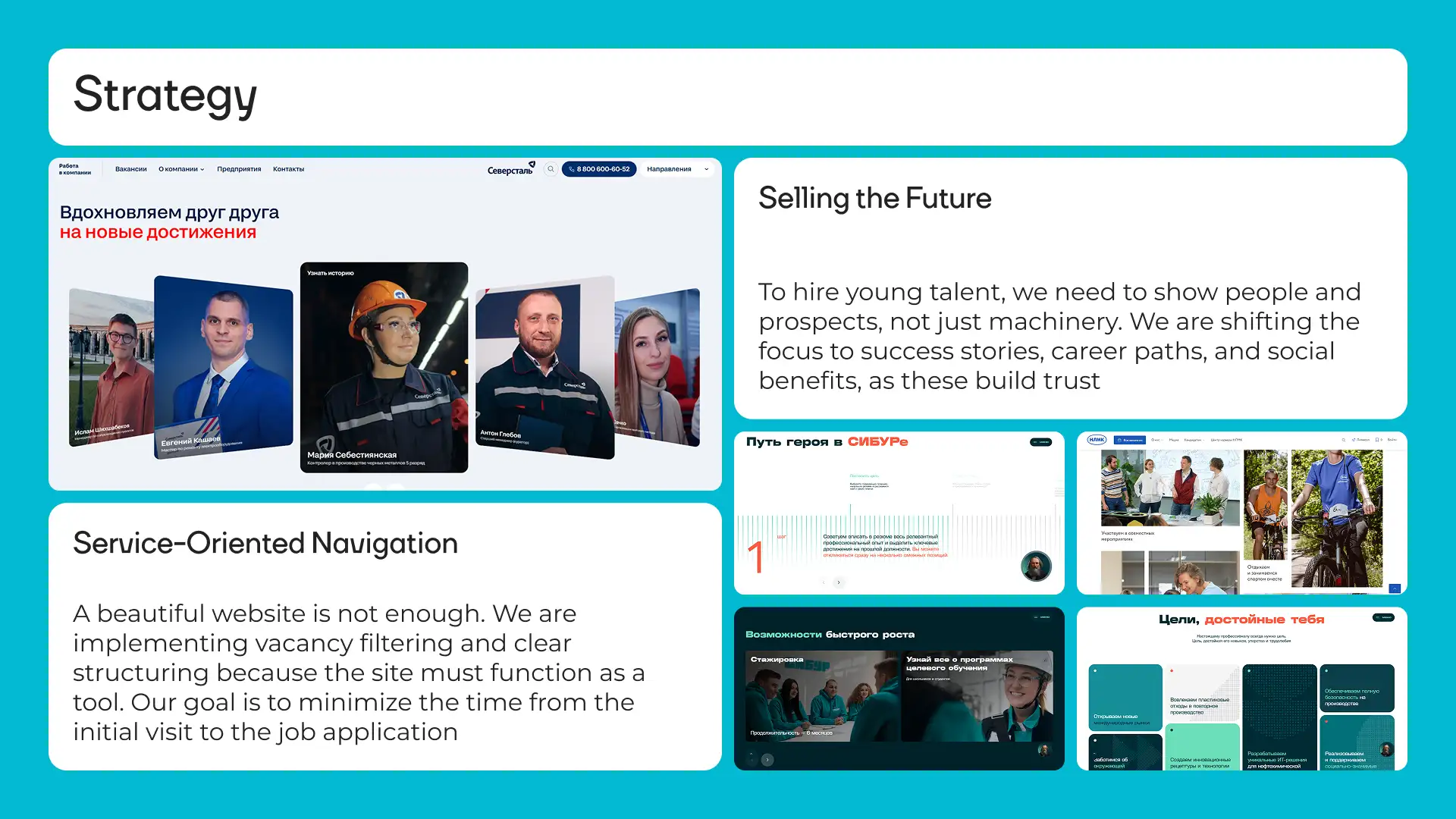
Strategy: sell the future, not the machines
To attract young talent, you show people and perspective — not equipment. A 25-year-old welder isn't choosing between factories; they're choosing between lifestyles. The strategy rests on three principles. A service approach to navigation. Filtering and vacancy structure, because the site must work as a tool — not a brochure. Selling the future. We shift from listing job duties to success stories, career tracks, and social proof. The candidate should picture themselves in three years, not read an instruction manual for a role. Mobile priority. 70% of traffic comes from phones. A welder searches for jobs on the subway using an old Android — not sitting with a MacBook in a coworking space.
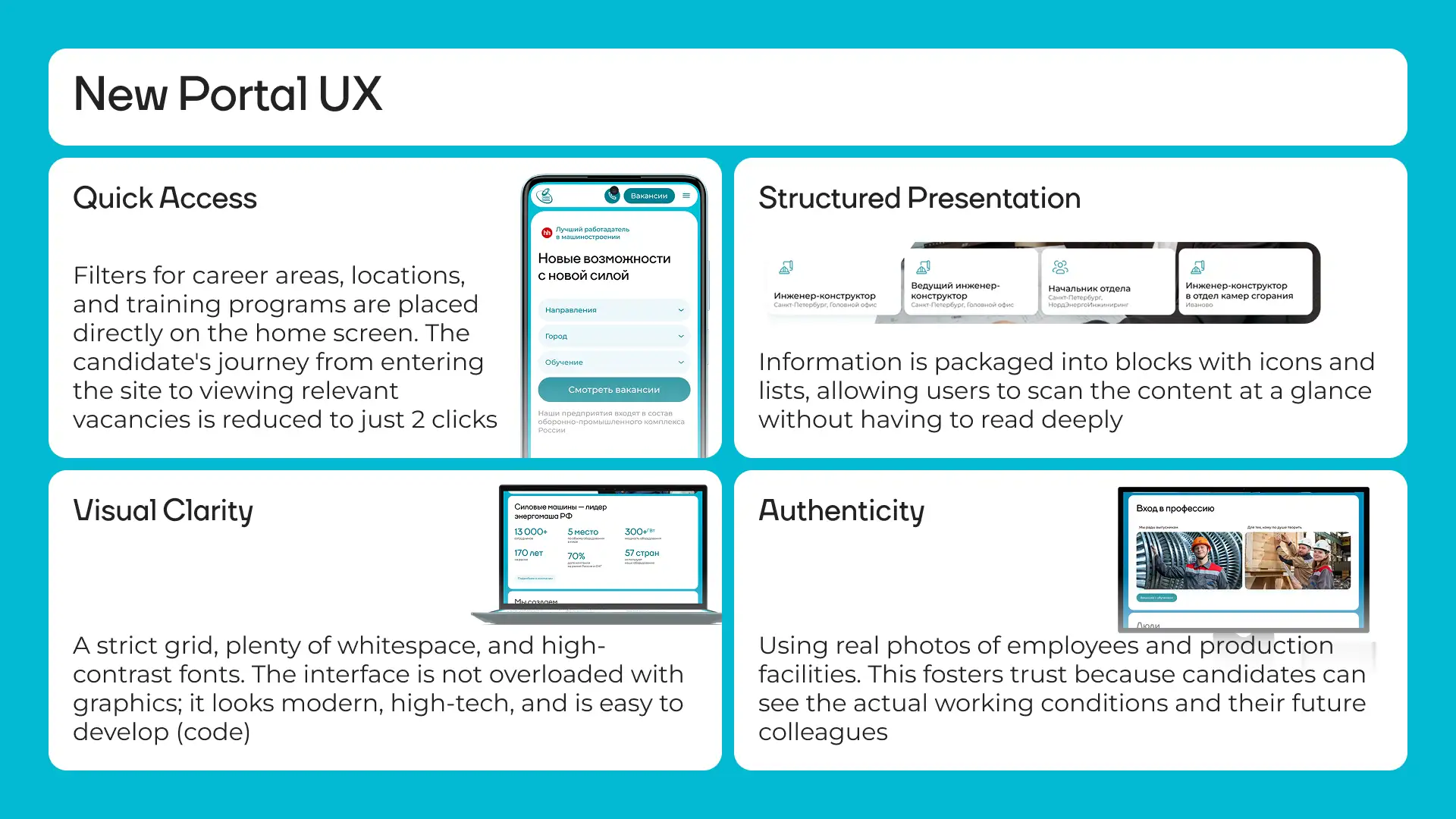
Four pillars of UX
Quick access. Filters by direction, city, and training availability are placed on the main screen — right below the headline. The candidate's path from landing on the site to a list of relevant vacancies is cut down to 2 clicks. Structured presentation. Information is packed into blocks with icons and lists so users can scan content at a glance without reading every word. In seconds, a candidate understands what's on offer and how one role differs from another. Visual clarity. A strict grid, generous whitespace, and high-contrast typography. The interface isn't overloaded with graphics — it looks modern and precise, and stays easy to implement in Bitrix. Reality. Photos of actual employees and real production floors. This builds trust because the candidate sees genuine working conditions and future colleagues — not AI-generated smiles from stock libraries.
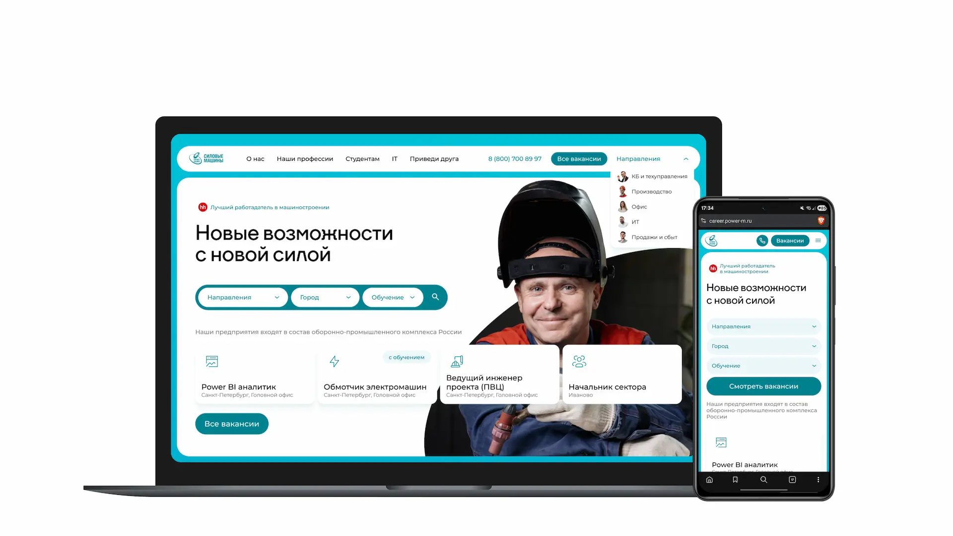
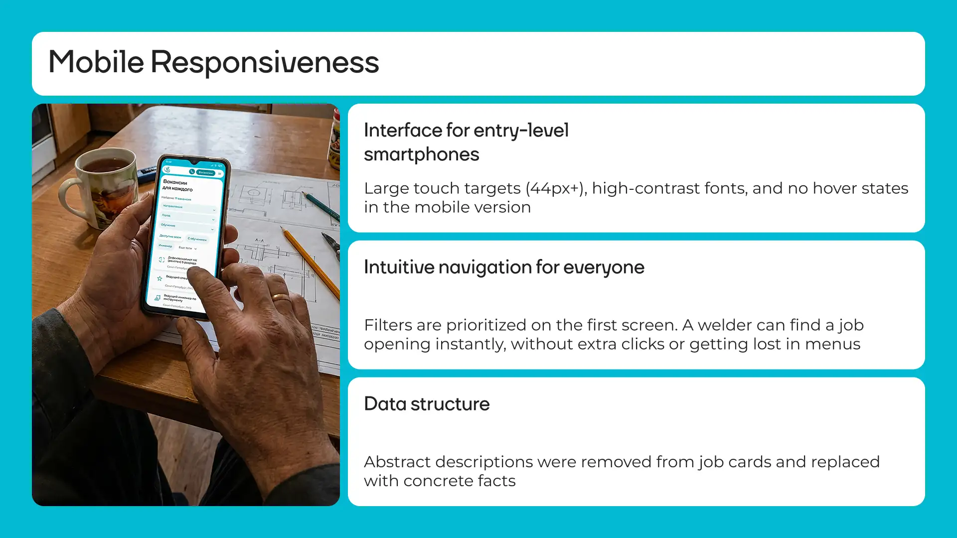
An interface for the basic smartphone
The mobile version was designed as a standalone product, not a scaled-down desktop. The user is a blue-collar worker with an inexpensive phone who has no time to navigate complex menus. Large touch zones from 44px prevent accidental taps. High-contrast fonts are readable outdoors in bright sunlight. Hover effects are removed entirely — they don't exist on touchscreens and only break the experience. Filters are on the first screen. A candidate finds a relevant vacancy immediately, without wandering through menus. Like a ride-hailing app: open, pick, apply. Job cards strip out corporate jargon and abstract language. Concrete facts replace it: what you actually do, what equipment you work with, whether training is included.
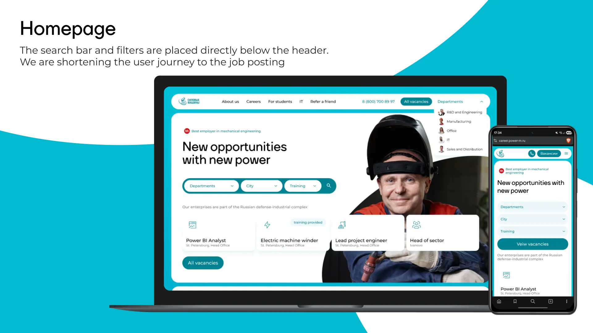
Cutting the path to a vacancy on the homepage
The search bar and filters are positioned in the hero block — no scrolling required. A candidate opens the site and the very first thing they see is the ability to instantly filter vacancies by direction, city, and training availability. Below the filters sits a live block of real open vacancies. Not an abstract 'View all vacancies' button, but specific roles the company is actively hiring for right now. This creates the impression of Power Machines as a dynamic, active employer — not an empty template.
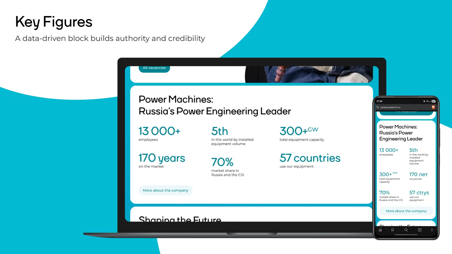
The numbers block
Numbers work better than ad copy because they require no interpretation. The block builds confidence: this isn't some small factory that might close next year. This is a backbone enterprise with real scale.
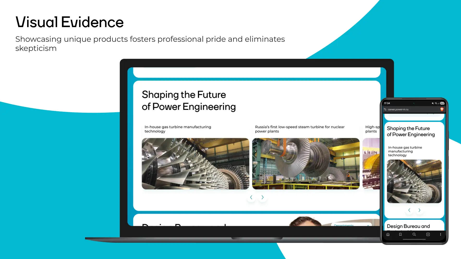
Pride in the profession
Power Machines makes one-of-a-kind things: Russia's first low-speed steam turbine for a nuclear power plant, proprietary gas turbines, hydrogenerators for the country's largest hydroelectric stations. If a candidate doesn't know what 'manufacturing' actually means here — show them. Demonstrating real products builds professional pride before day one on the job and removes skepticism before it starts. No stock photos. Only real workshops, real machines, and real employees.
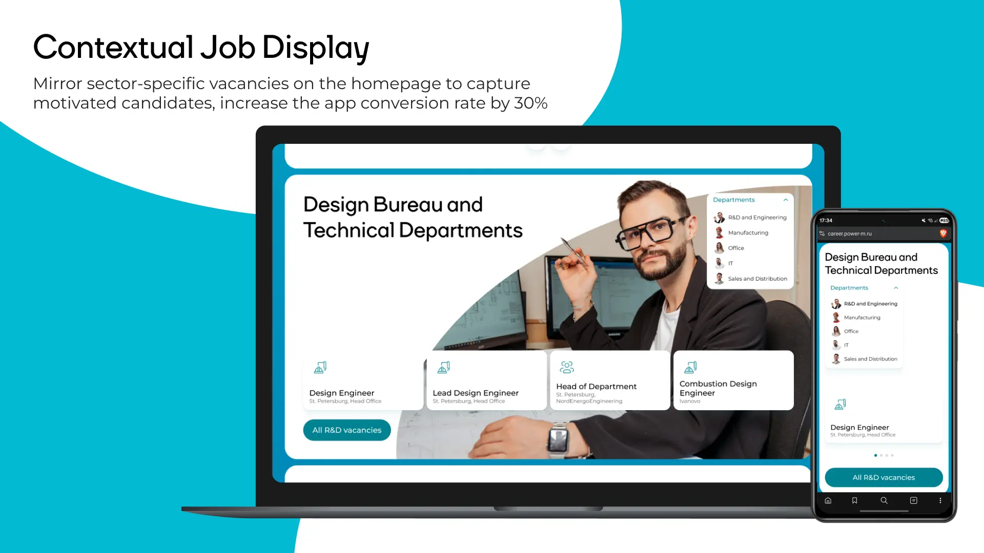
Catching the hot candidate
A standard funnel loses the candidate somewhere between the 'About' page and the vacancies list — they explored a direction, got interested, but don't know where to click next. The fix: every thematic block on the homepage duplicates the vacancies from its own direction right below the description. No need to go back to the homepage, find the 'Vacancies' section, and filter from scratch. Contextual vacancy display is estimated to increase application conversion by 30%, because it eliminates the gap between interest and action.
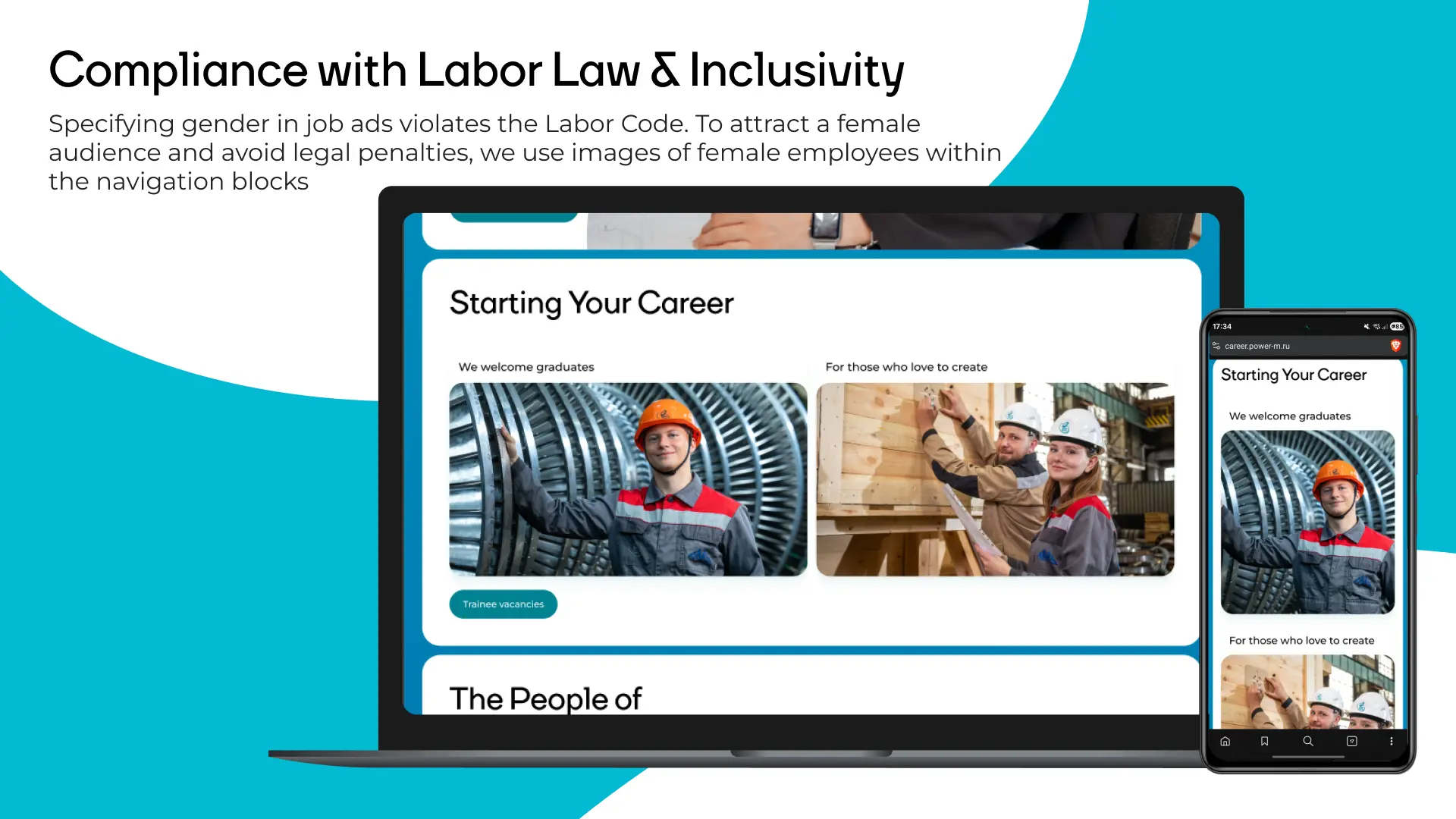
A female audience — without the fines
Most industrial job portals specify gender in listings — 'position for men' or use exclusively male pronouns. This is a direct violation of Russian labor law and carries real financial risk. At the same time, those companies are cutting off a female audience that in many specializations represents a significant share of qualified talent. The fix: navigation blocks for each job direction use photos of both women and men in equal proportion. No gender indicators anywhere in the interface. The visual is neutral by default. The company reaches a broader audience and is legally protected at the same time.
Vacancies page
The filter is always visible alongside the vacancy list. A candidate never needs to scroll back to the top to change parameters — they adjust on the fly without losing their place. The list format lets users scan vacancies twice as fast as a card layout, because information is organized in a clean horizontal flow.

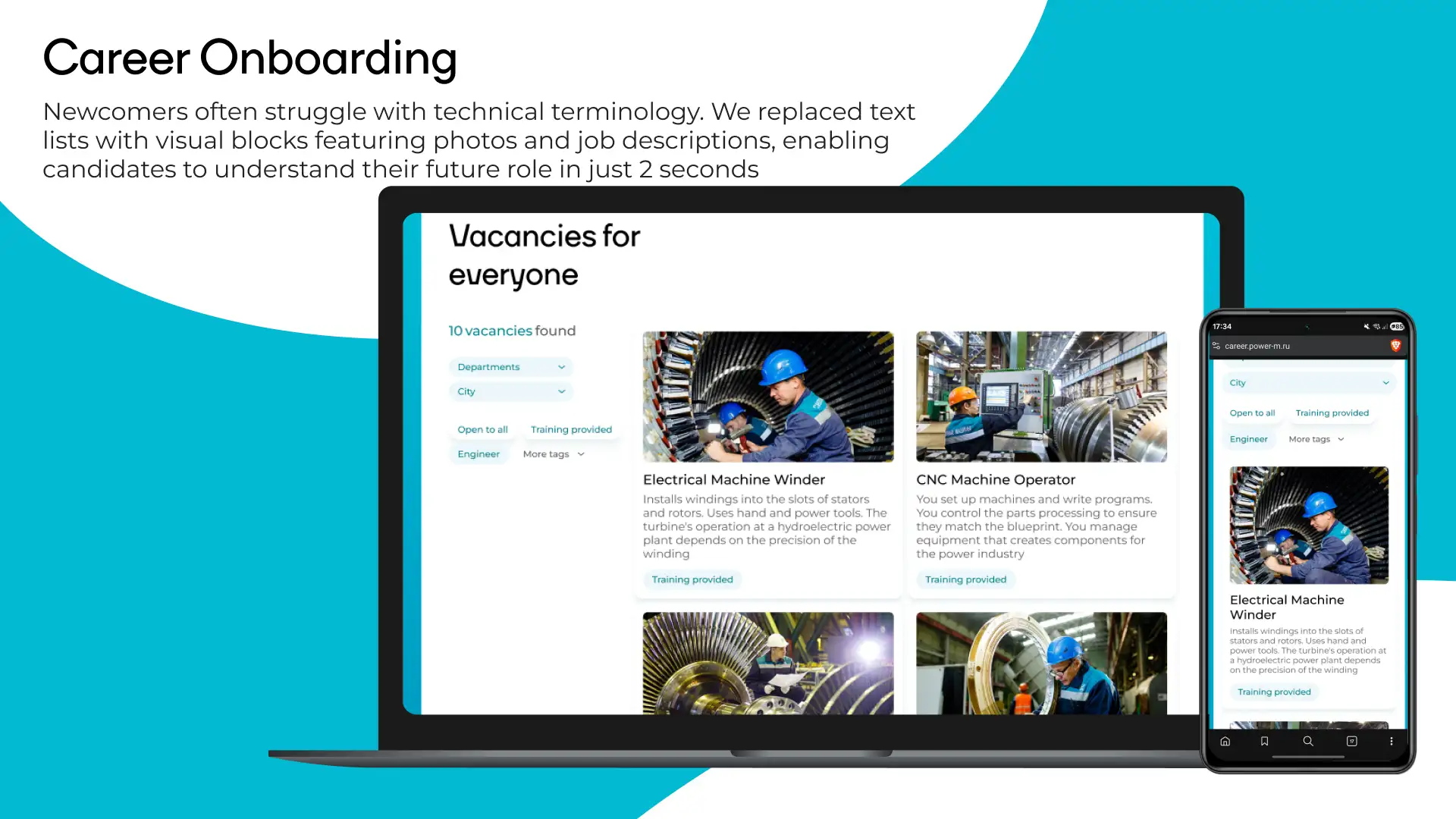
Entry into the profession for those who don't know the terminology
'Electrical machine winder' or 'NDT defectoscopist' — a newcomer with no industrial background has no idea what these roles are or what the work actually looks like day to day. Instead of a text list of job titles, we introduced visual cards with a real photo of the workplace and a plain-language description of the work. You're laying windings into stator slots — here's what it looks like, here's what you do with your hands, here's what the result depends on. The 'With training' tag addresses the biggest fear of someone without experience: 'they won't hire me.' The company answers directly: we will, and we'll teach you.
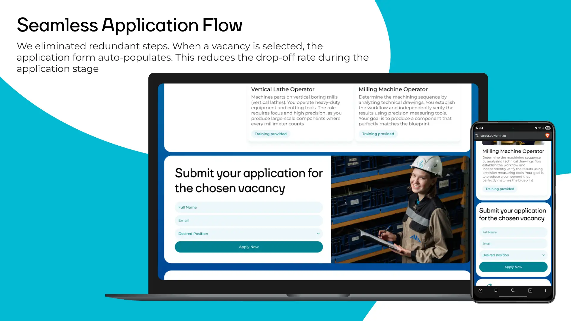
Seamless application: removed the unnecessary steps
The standard application flow on industrial portals looks like this: found a vacancy → clicked 'Apply' → redirected to a blank form → manually typed the job title → filled in five fields → submitted. Candidates drop off at every step. We removed the friction. When a candidate clicks 'Apply' directly on the vacancy page, the application form auto-populates the job title. The candidate only enters their name and email. Less friction = fewer drop-offs at the final stage of the funnel.
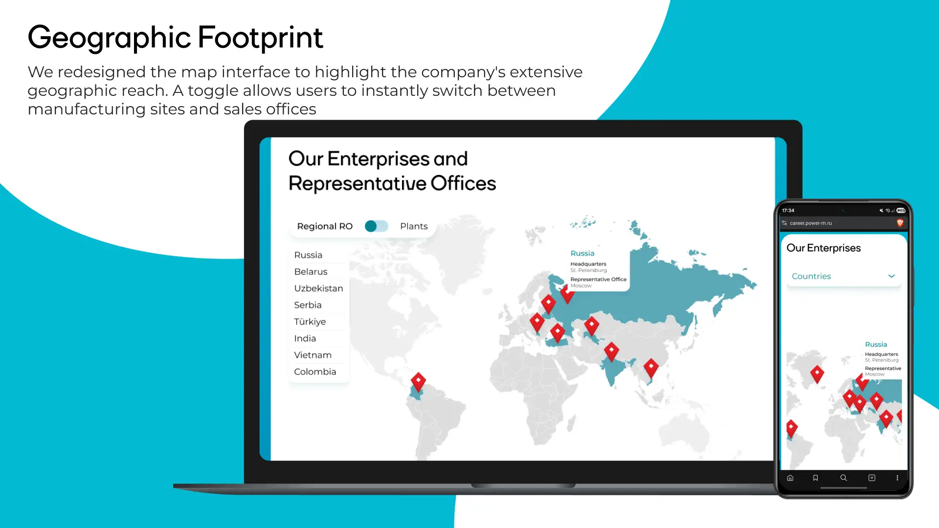
Geography: company scale as an argument
Power Machines operates in Russia, Belarus, Uzbekistan, Serbia, Turkey, India, Vietnam, and Colombia. That's a compelling argument for a candidate thinking about a career, not just a job close to home. We redesigned the map interface: a toggle instantly separates offices and manufacturing plants. A candidate sees either a sales map (where managers work) or a factories map (where things are built). This eliminates confusion and lets an applicant find their city immediately. The geography block also serves the 'About Us' section — it communicates international scale without a single word of marketing copy.
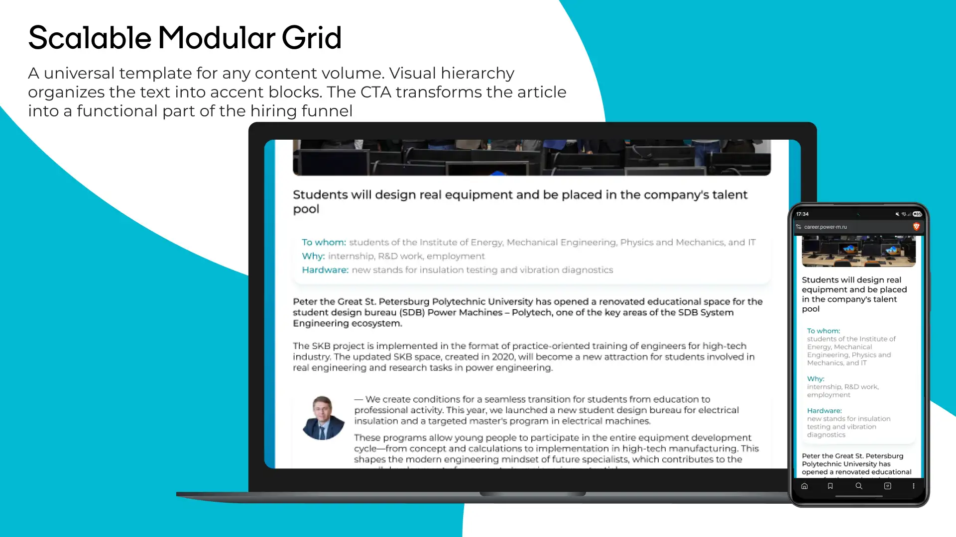
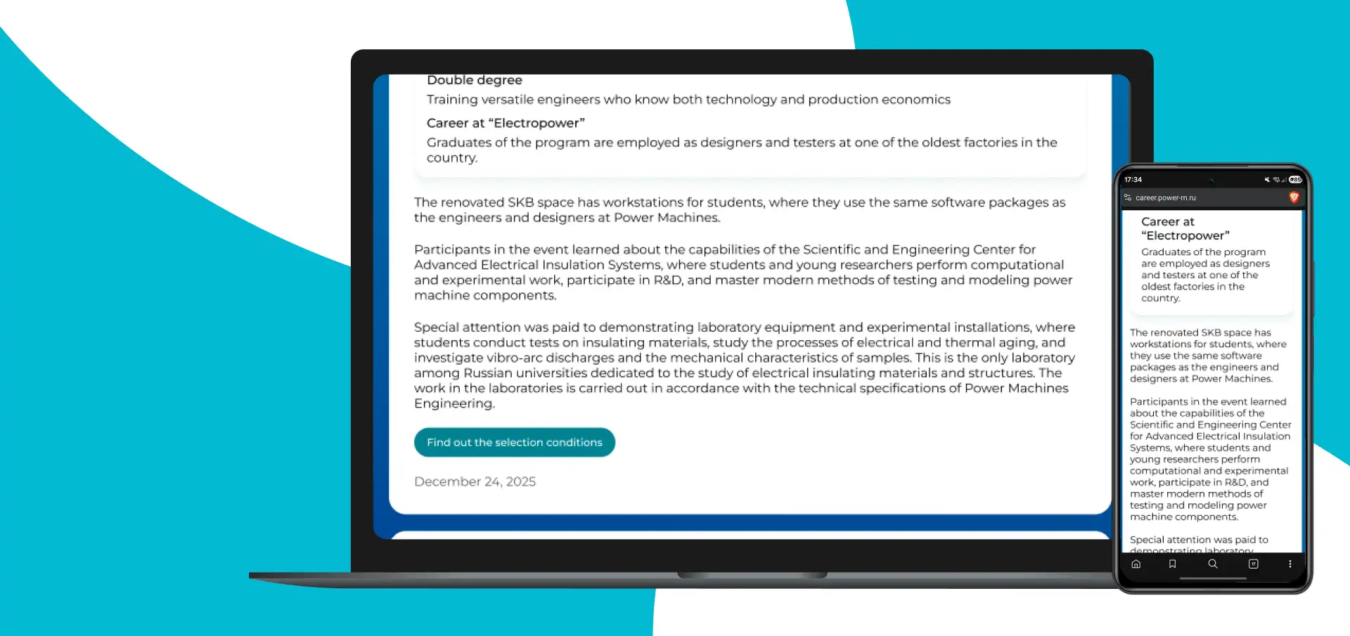
Content editors won't break the layout
Bitrix is a hard constraint. Content managers will add articles through a standard editor, and the design must hold up at any content length without breaking. The universal article page template works at any depth: a short news post, a long-form feature, a technical document. Visual hierarchy structures the text with accent blocks — headings, pull quotes, lists — without requiring a designer's intervention. Every article has a built-in 'Apply for a vacancy' CTA block. A company news piece, a factory floor report, an interview with an engineer — each becomes an entry point into the hiring funnel.
Summary
1st place at the federal 'Young Design' competition. The concept was approved by top management. The client received a high-conversion interface that respects candidates' time and solves a concrete business problem: uninterrupted hiring across their factories. Every decision in this project is backed by data and funnel logic.