UX Audit for DeFi Hobba.io
Product
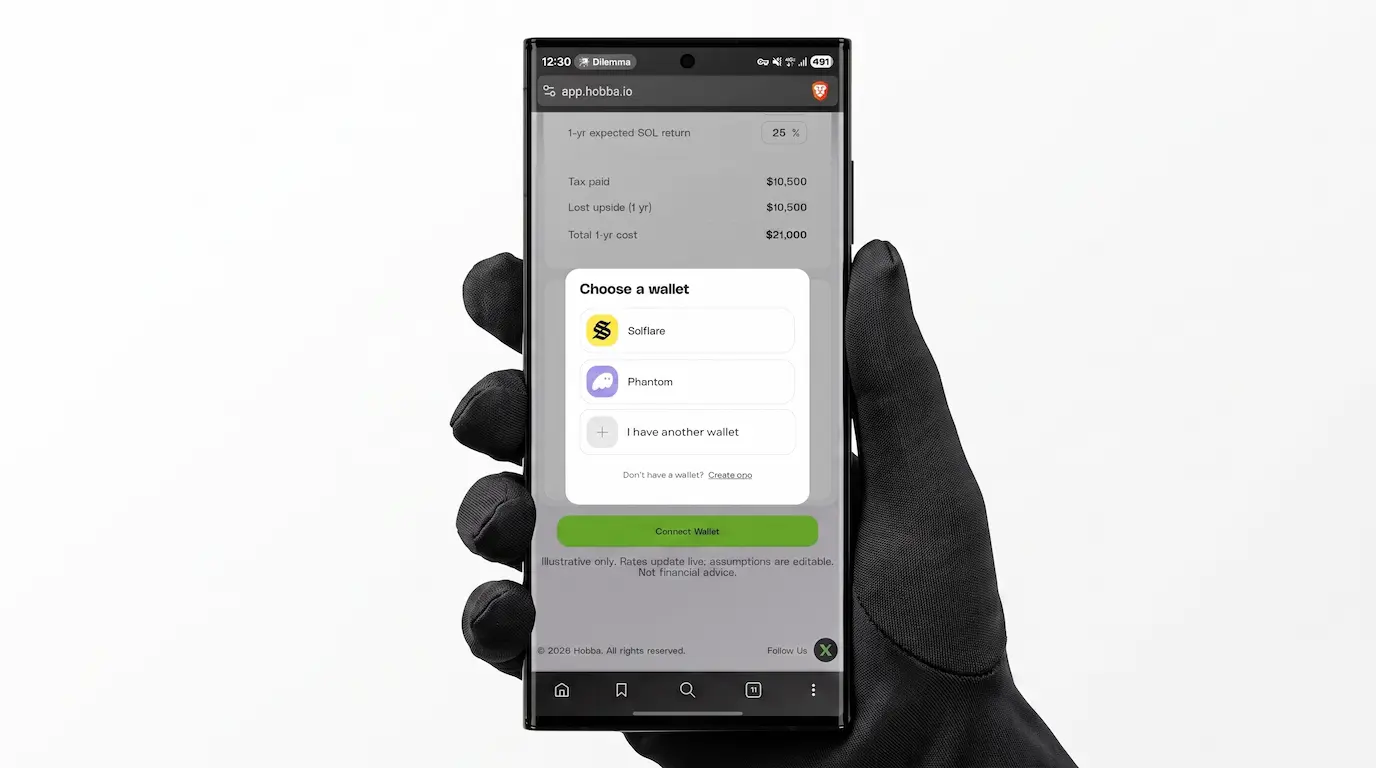
Hobba.io is a DeFi protocol on Solana acting as an automated loan manager. Users deposit crypto collateral to borrow USDC. Target audience: Users expecting crypto price appreciation who need liquidity for large purchases without selling their assets. They deposit collateral to receive stablecoins, with the option to leave the loan unpaid. USP: Instead of paying interest, users often earn yield on their loans because the protocol reinvests the collateral.
Role
External UX Consultant. Hired to identify interface weaknesses and logical errors. To ensure a thorough review, I conducted qualitative interviews with the target audience and deposited my own funds to test the end-to-end user journey.
Problem
Transitioning out of the testing phase, the team was unsure if the core concept was clear, how intuitive the UI was, and what initial impression it made on users.
Key Insights
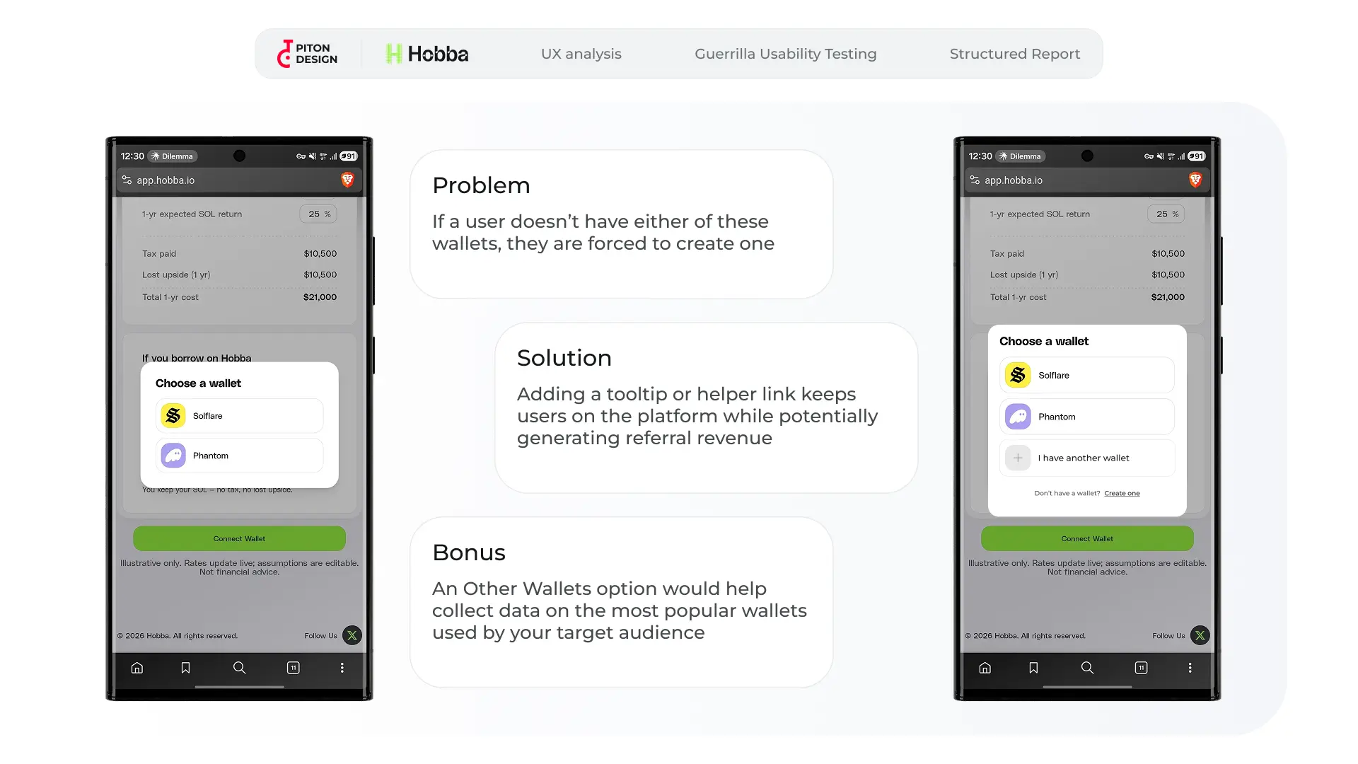
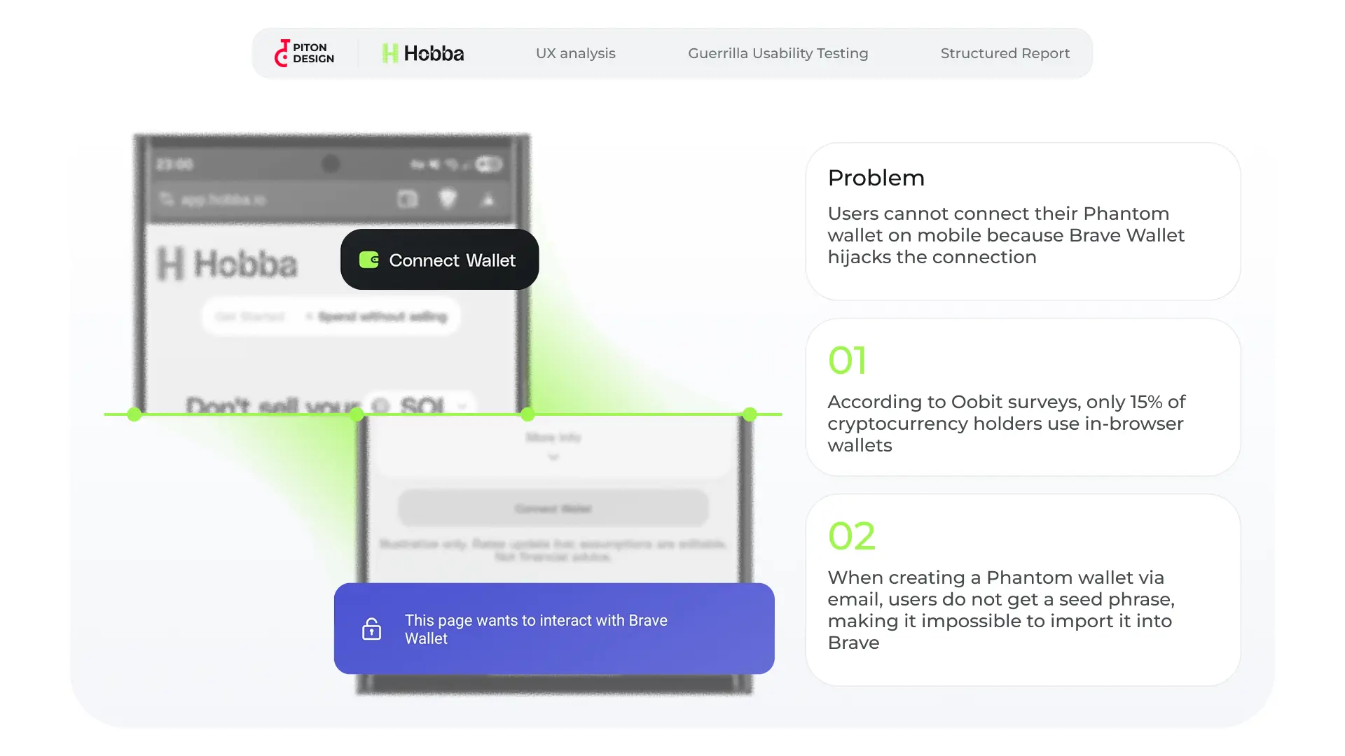
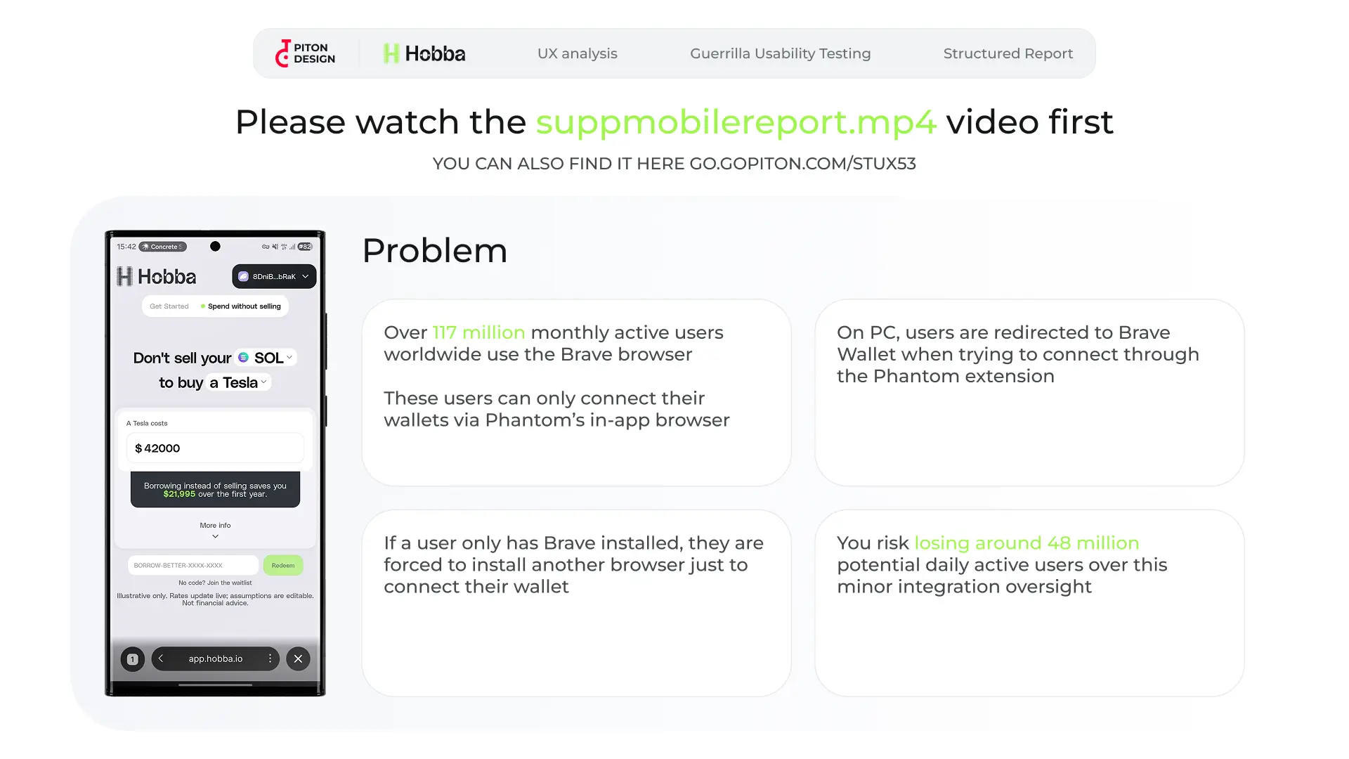
Lack of Dark Mode: While evaluating logic and accessibility heuristics, testing the platform with a prominent Solana community member revealed a major oversight: the lack of a dark mode. In the crypto community, dark interfaces are highly preferred. Brave Browser Integration Issue: The project was excluding over 100 million monthly active users from its target audience due to a wallet connection conflict. In Brave browser, the native Brave Wallet hijacks the connection. Since Hobba only supports Phantom and Solflare, users who created these wallets via social sign-on (without a seed phrase) cannot import them into Brave Wallet, making connection impossible. Browser-Native Wallet Adoption: According to Oobit, only 15% of crypto holders use browser-native wallets due to security concerns.
Constraints
The test was limited to 5 days and 1 SOL, which is not enough to evaluate the product under long-term real-world conditions. Many interface issues only surface over time.
Process
To replicate a first-time user experience, both the qualitative tests and my professional audit were conducted with zero prior familiarity with the product. We recorded raw screen sessions. The unedited footage, complete with user hesitation and pauses, was delivered to the client. If a user spends 30 seconds trying to understand an on-screen element, that element needs to be changed.
Deliverables
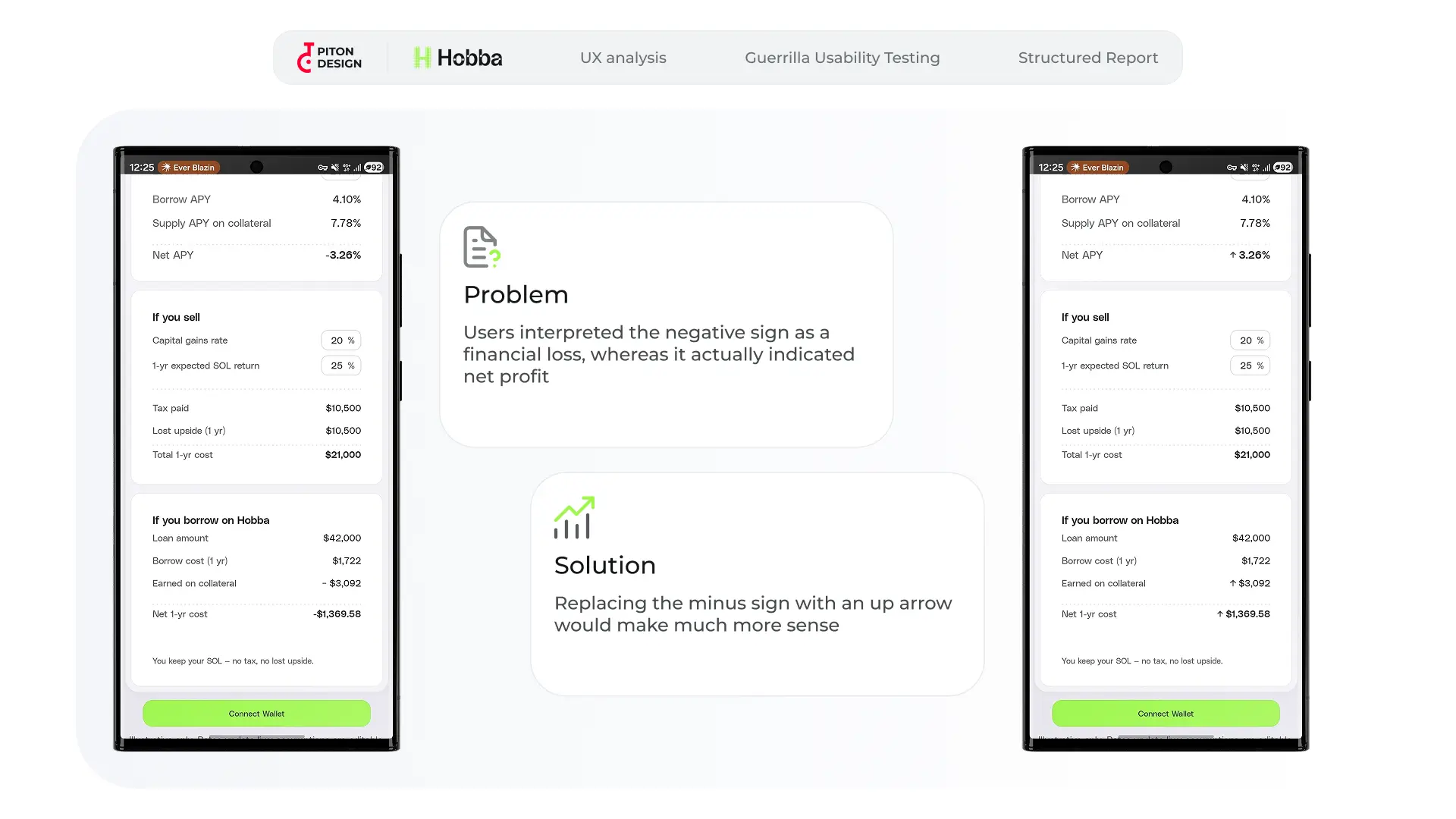
The report as delivered to the client, including screencasts and the presentation, is available below: Screencast link:
Lessons Learned
As this audit was conducted alongside other specialists, we compared delivery workflows. The main takeaway: to speed up implementation, findings should be delivered as both a presentation and ready-to-use task tickets. This saves the client from manually translating presentation slides into Jira/GitHub tasks and speeds up development.