Presentation Template for IThub College Back-Office
About the Product
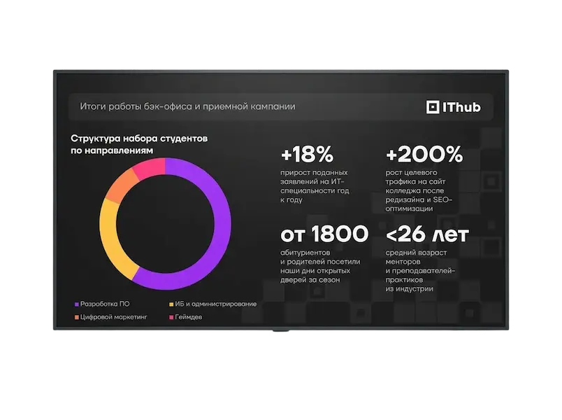
IThub College is a private international college of information and creative technologies offering education for grades 9, 10, and 11 based on a business-oriented methodology.
Role in Development
Acted as the sole designer under an art director who verified the proposed solutions. The primary goal was to refresh and modernize the outdated, misaligned design that lacked support for animation and interactivity. That was the brief as received. Since the requirements were quite vague, I initiated a call to clarify the details.
Constraints
Adhering to the college brand book and working strictly within PowerPoint. I attempted to understand this decision, as it would be more logical for a Russian business to use platforms like Yandex Slides to remain independent of external policies. However, the decision was made by management and was non-negotiable.
Problem
The college art director (my direct client) had long tried to initiate a redesign of the core presentations, but upper management ignored the requests. Ultimately, just a week before the Open House event, the redesign was approved—but as an emergency request. Furthermore, management refused to provide initial data: presentation topics, presentation formats, or department requirements. I had to work in an information vacuum under a tight deadline.
Why the Old Solution Didn't Work
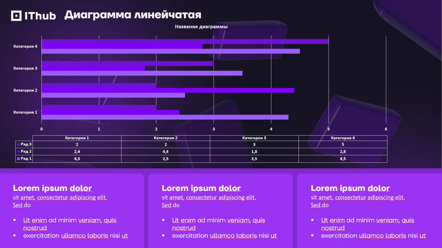
The old design was cluttered, making it difficult to digest the information on the slides. Old master presentation:
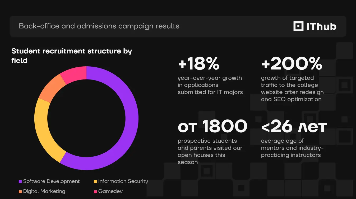
New presentation for the back-office:
Success Criteria
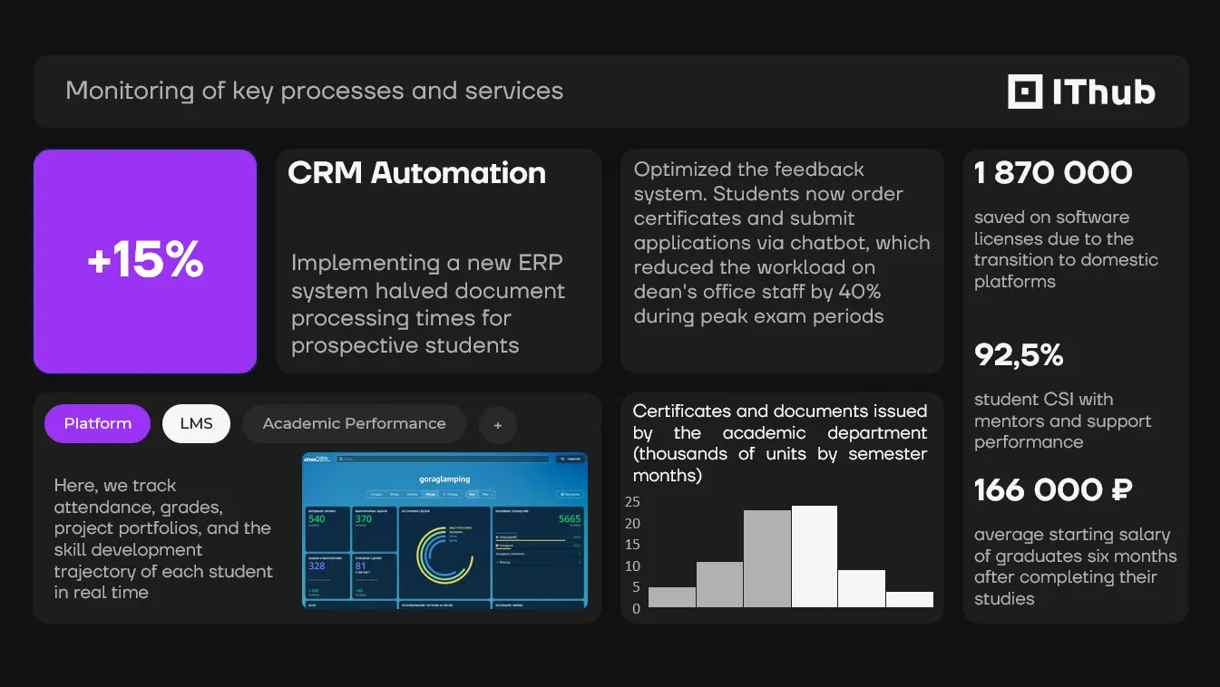
Without data from stakeholders, I took the opposite approach. Instead of designing for specific content, I built the grid around worst-case high-density scenarios. Each tile and block was designed to handle excessive amounts of infographics and text. If future slides remained simple, the layout would look clean. If users overloaded them with data, the layout would hold up and remain readable.
Vague Requirements at the Start
At the start, I tried to gather as much data as possible: the back-office departments, the most common presentation topics (to prepare the required slide layouts), and how the presentations would be used (delivered in person on a large screen or shown during video conferences). Without this information, I had to improvise. I prioritized handling high-density complex infographics and text while maintaining readability.
Key Insight
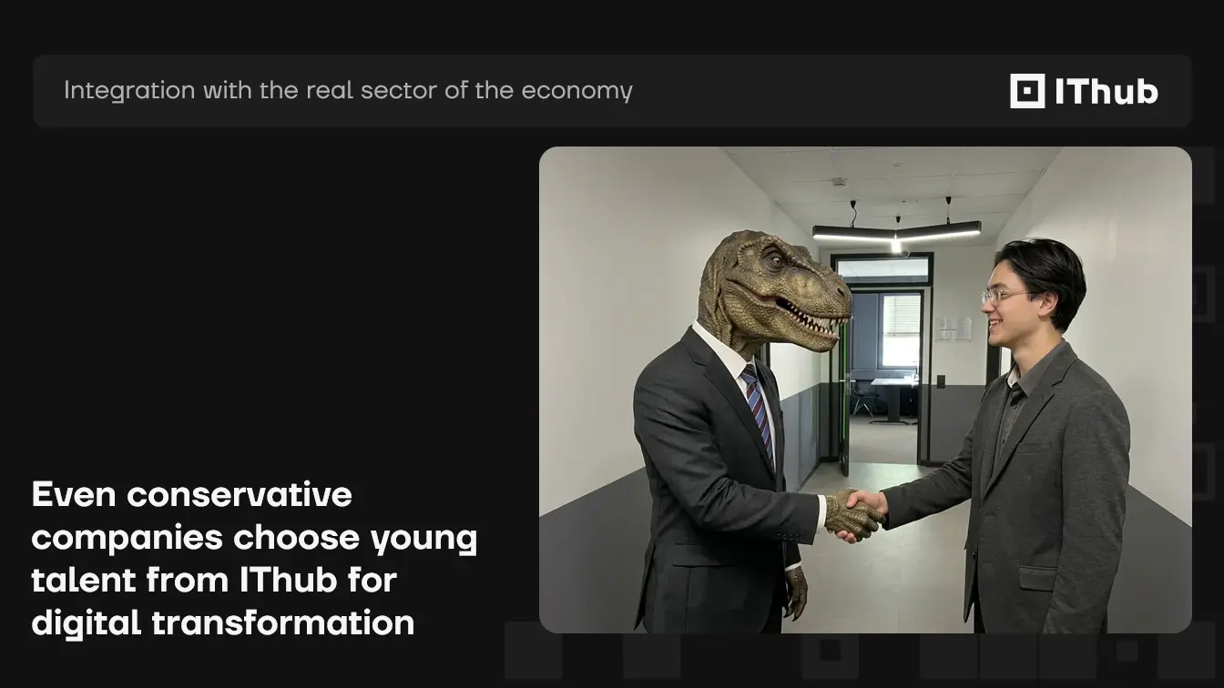
I realized the client's priority was speed, consistency, and visual polish. Consequently, during the first and only round of revisions, I integrated the college's official mascot, adapting it to the presentation context.

Challenges
As I design mostly in Figma, I pay close attention to frame responsiveness. It was a challenge to step away from Auto Layout and find an alternative way to keep content aligned to the grid, even as the volume of information changed.
Alternative Layout Concepts
In the first version, I placed standard text over objects to create depth and layers. I later discarded this approach for a more stable and robust solution: embedding text directly inside shape boxes instead of grouping them. To keep a heading and body text constrained together, I used invisible embedded Excel tables.
How the Presentation Solves the Client's Problem
The design was delivered a day before the deadline, complete with rationale to help the client present it to management. When end-users edit the slides, they won't struggle with broken text wraps or easily disrupt the visual system.
Critical User Interaction Scenarios
It was essential to build a template that looks polished and remains stable in practice. Users shouldn't have to worry about reducing or refitting content. I also considered potential connection issues during presentations. In the future style guide to be compiled by another team, I recommended using WebP and AVIF instead of PNG and JPG. This will reduce overall presentation file size by up to 30% and speed up slide load times by 50%. Conversion takes almost no time, but ensures reliable loading over unstable networks.
Results
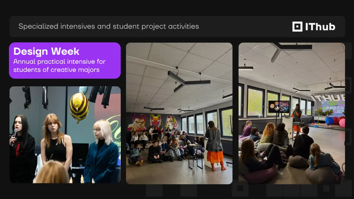
Client feedback: “No direct feedback from the back-office yet, they took it straight into production. I expect next year we'll work on refining them further and bringing everything to a unified standard. Your work was solid and well executed.”