High-conversion landing page for Cozy Sreda
Business transition to B2B
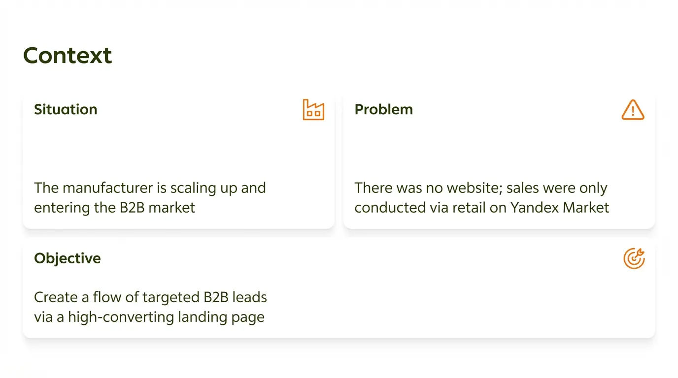
While designers pray to grids and whitespace, we deal with conversion and logic. If an interface doesn't bring money to the business, it's digital trash, no matter how beautiful it looks. In the project for Cozy Sreda, the task was to transform a retail seller into a B2B supplier for HoReCa. The client, a manufacturer scaling to the B2B market, approached us with a problem: they had neither a website nor a reputation in the professional environment, and all sales went through marketplaces. Our task was to develop a landing page generating leads.
Jobs To Be Done
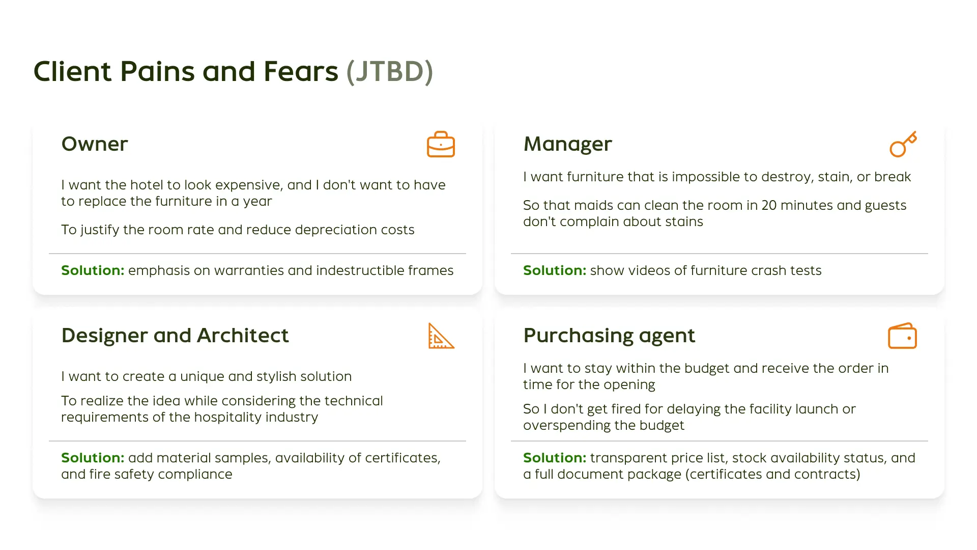
A B2B customer is not an impulsive buyer. They have strict KPIs, deadlines, and budgets. We decomposed their needs using the JTBD method and found out that the client consists of four main psychotypes with their own barriers.
Solution Architecture
We implemented functionality addressing TA pains: — PDF presentation for budget protection, allowing the manager on the client side to justify the purchase to their management. — Crash test videos as empirical proof of quality work better than a thousand words.
UX Design and Cart Elimination
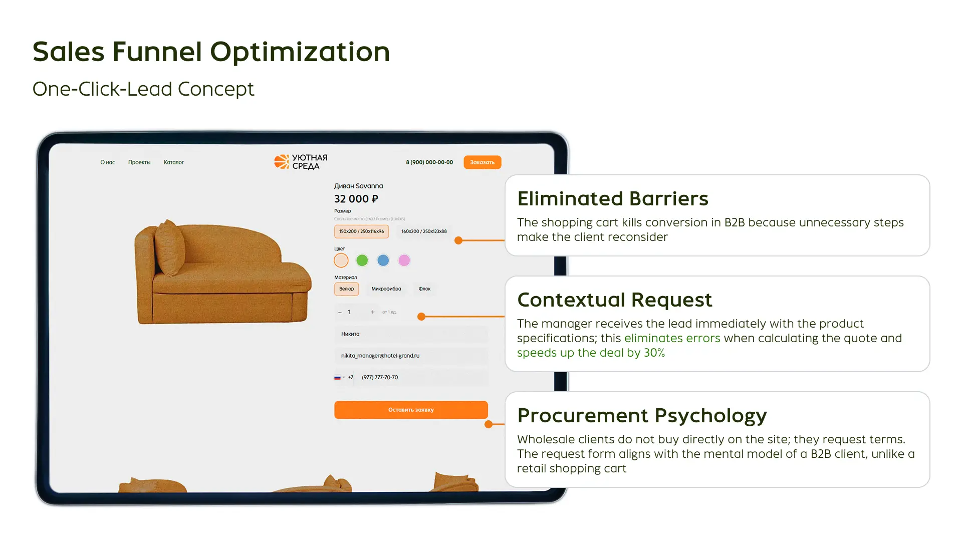
In B2B, a standard cart is an atavism. Wholesale clients do not pay for a truckload of sofas with a card on the website. Extra clicks kill conversion. We threw out everything unnecessary.
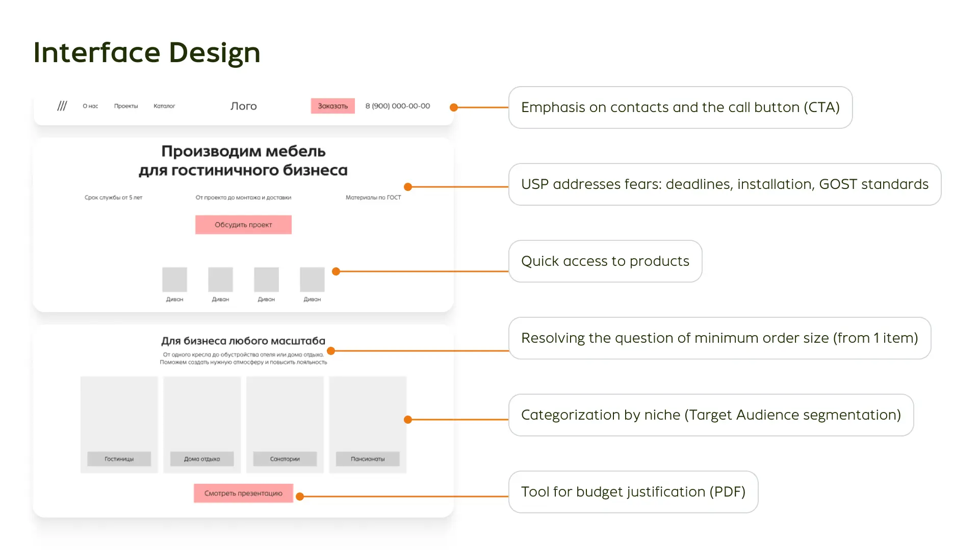
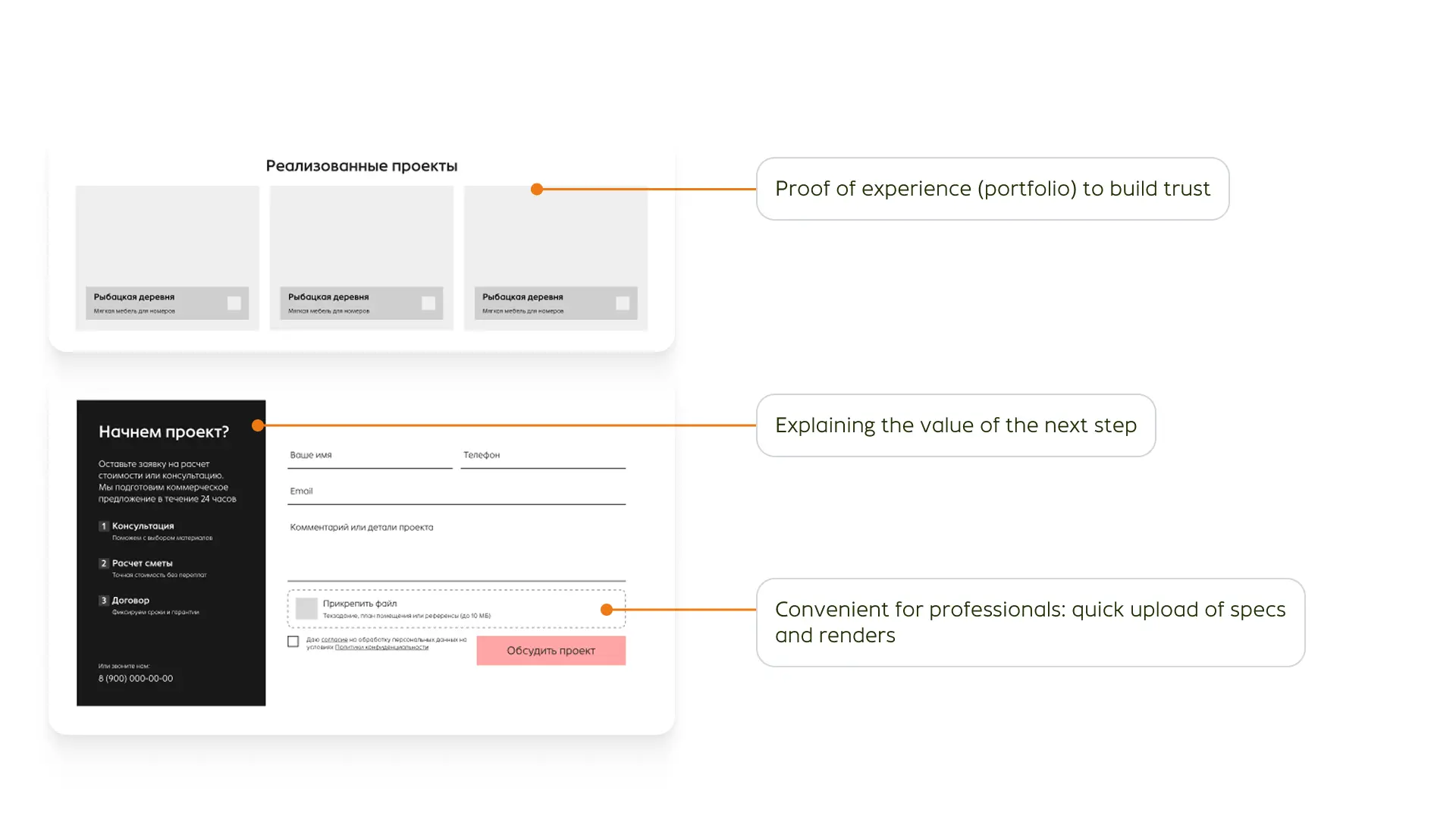
We implemented the One-Click-Lead concept. Instead of a buy button, we implemented a context application. The manager receives a lead immediately with the specification of the product of interest. This speeds up deal closing by 30% and eliminates the human factor in calculations.
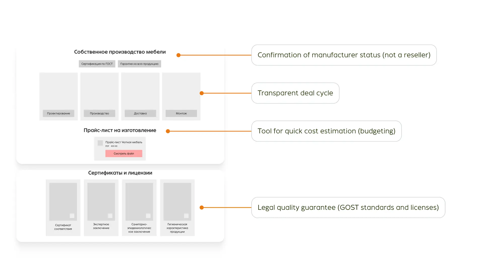
The interface is designed answering questions before they are asked: — Confirmation of direct manufacturer status (differentiation from resellers) — Tools for quick budgeting — Legal guarantees and GOST standards in a visible place
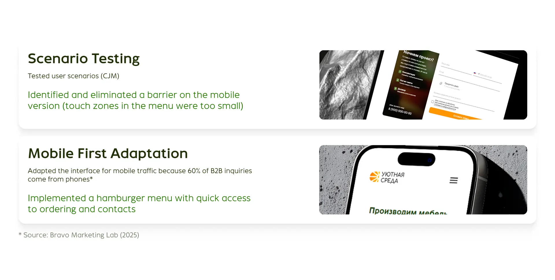
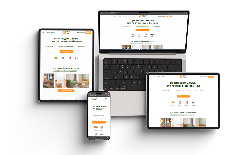
Mobile First Adaptation
60% of B2B requests come from mobile devices. Decision-makers are often in the field, not in the office. A website that works incorrectly on a smartphone means a lost client. We developed a responsive design with a priority on usability: increased touch zones and instant access to contacts via the burger menu.
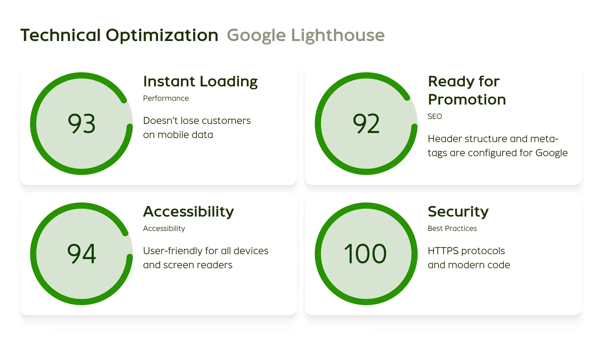
Technical Optimization
Google Lighthouse indicators confirm the quality of our architecture. The site loads instantly without losing users even with unstable mobile internet.
Summary
The client received a stable flow of targeted leads, and we demonstrated that a systematic approach and logic in design defeat subjective 'like or dislike'.